Design styles for your course
52 design styles for your course, one a week
Learners judge your course on how it looks before they read a word, and if you sell your course, the look is part of what they buy. This countdown runs through 52 real design styles, one for each week of the year, shown on online courses, slides and workbooks. Start at No. 52 in the first week of January and finish on No. 1 at Christmas. Every style here has a documented history, and our sources are listed at the end.
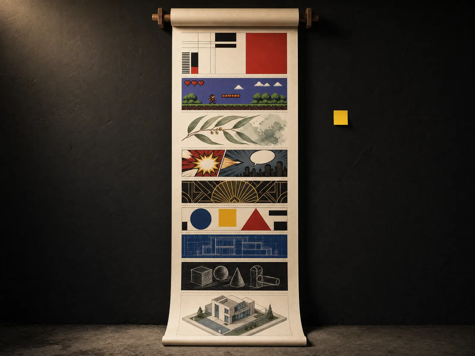
Learners judge the design first
People decide whether a course looks worth their time in the first few seconds. A clear, confident design tells them someone has thought about their time. A tired template tells them the opposite, however good your knowledge is underneath.
Design does a job inside the course too. A consistent style helps learners find their way around, so their attention stays on what you’re teaching. When you sell your course, the style becomes part of your brand. People recognise your course by it in a course catalogue or their inbox.
How the countdown works
We’ve ranked the styles by how hard they work in a course you build to sell or to train people. No. 52 is the boldest and the hardest to use well. No. 1 is the style we’d pick first for most courses. Each style is shown on the kind of material it suits, from phone lessons and slides to workbooks and certificates.
Each week has one small thing to try and the prompt we used for its picture. Pick one screen, one slide or one handout and test the style on it. By December you’ll know which look suits your course and your learners.
How we made the pictures
We made every picture in this article with ElevenLabs, using its image tools and the GPT Image 2 model. At high quality, each picture cost about 17 US cents in November 2026. Under each style you’ll find the prompt we used. Copy it, swap in your own topic and course title, and make a picture for your own course.
Try ElevenLabs (opens the ElevenLabs website in a new tab)
Discover Learning is an independent ElevenLabs affiliate. If you sign up through our link, we may receive a commission. It doesn’t change our advice or your price.
ElevenLabs and the ElevenLabs logo are registered trademarks or trademarks of ElevenLabs, Inc. Discover Learning is not sponsored by, endorsed by, or affiliated with ElevenLabs except as an independent participant in the ElevenLabs Creator Affiliate Program.
Quarter 1, weeks 1 to 13
Big, bold and best in small doses
Week 1 of 52
No. 52 Glitch art
Origin Nam June Paik distorted televisions with magnets in 1965, and the name spread from 1990s glitch music to visual art.

Glitch art turns digital errors into decoration: colour channels pulled apart, scan lines torn sideways, blocks of pixels in the wrong place. It looks like the screen is breaking, which is why it grabs attention.
In a course
A title screen for a cyber safety or scam awareness module, where “something’s wrong” is the whole point.
Try it this week
Glitch one title screen and keep everything else calm. Keep body text clear of glitches, and don’t let anything flicker.
The prompt for this picture
Photo for a training article. On a dark desk lit by one warm lamp, a smartphone stands upright in front of a laptop. Both screens show a scam awareness micro-lesson for small business staff designed in GLITCH ART: the title is broken by digital errors, with red, green and blue colour channels pulled apart, horizontal scan-line tears, displaced blocks of pixels and corrupted-data streaks in cyan and magenta on black. The phone title reads “Spot the scam” and the laptop shows the same glitched title above a plain white button “Begin”. Spell the quoted words exactly. Show all other small text as unreadable placeholder lines. Realistic devices, no logos.
Week 2 of 52
No. 51 Psychedelic art
Origin Flourished in San Francisco from about 1966 to 1972, through poster artists such as Wes Wilson and Victor Moscoso.
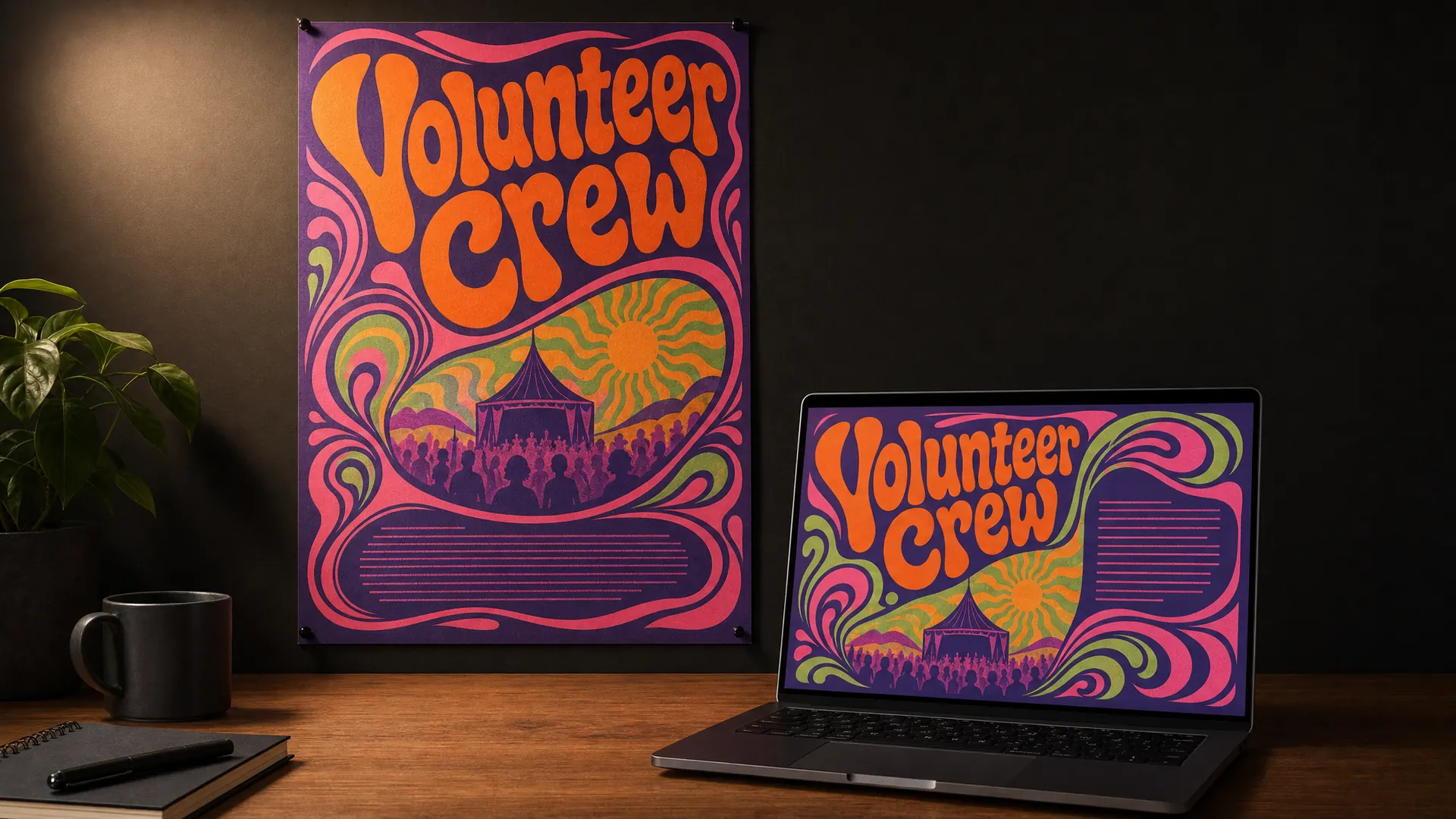
Psychedelic posters stretch lettering until it fills the space like liquid, then put clashing colours side by side so they seem to vibrate. It’s loud, joyful and hard to read on purpose.
In a course
The cover of a course for music festival volunteers or event crews, where the mood matters more than the words.
Try it this week
Borrow the swirling lettering for one heading. Put every instruction beside it in a plain font.
The prompt for this picture
Photo for a training article. On a dark wall lit by one warm light, a printed A2 poster is pinned to the wall and a laptop on the desk below shows the same artwork as a course cover, for a music festival volunteer crew course. Designed in 1960s PSYCHEDELIC POSTER style: hand-drawn lettering that swells and melts to fill the shape, swirling organic curves, vibrating complementary colours (hot orange against violet, pink against acid green). The lettering reads “Volunteer Crew”. Spell the quoted words exactly. Show all other small text as unreadable placeholder lines. Realistic devices, no logos.
Week 3 of 52
No. 50 Grunge typography
Origin Grew out of photocopied flyers from the grunge era. David Carson’s layouts for Ray Gun magazine in the early 1990s are the famous example.
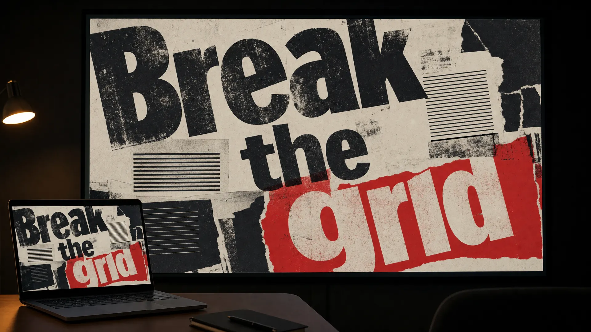
Grunge type looks photocopied, torn and layered. Lines of text overlap, run off the edge and sit at angles. It breaks every rule of tidy layout, and it means to.
In a course
A slide deck for a creative workshop, such as street art, band promotion or zine making.
Try it this week
Rough up one section divider slide. Keep the teaching slides clean so people can follow.
The prompt for this picture
Photo for a training article. In a dim training room lit by one warm light, a large wall screen shows a slide from a street art workshop, and a laptop on a table in the foreground shows the same slide deck. Designed in 1990s GRUNGE TYPOGRAPHY: layered, distressed and photocopied type, overlapping text blocks set at angles, letters running off the edges, torn paper scraps and ink smudges, black and off-white with one red. The big words read “Break the grid”. Spell the quoted words exactly. Show all other small text as unreadable placeholder lines. Realistic devices, no logos.
Week 4 of 52
No. 49 Cyberpunk
Origin Bruce Bethke coined the word in a 1983 short story. The film Blade Runner (1982) is the classic example of its look.
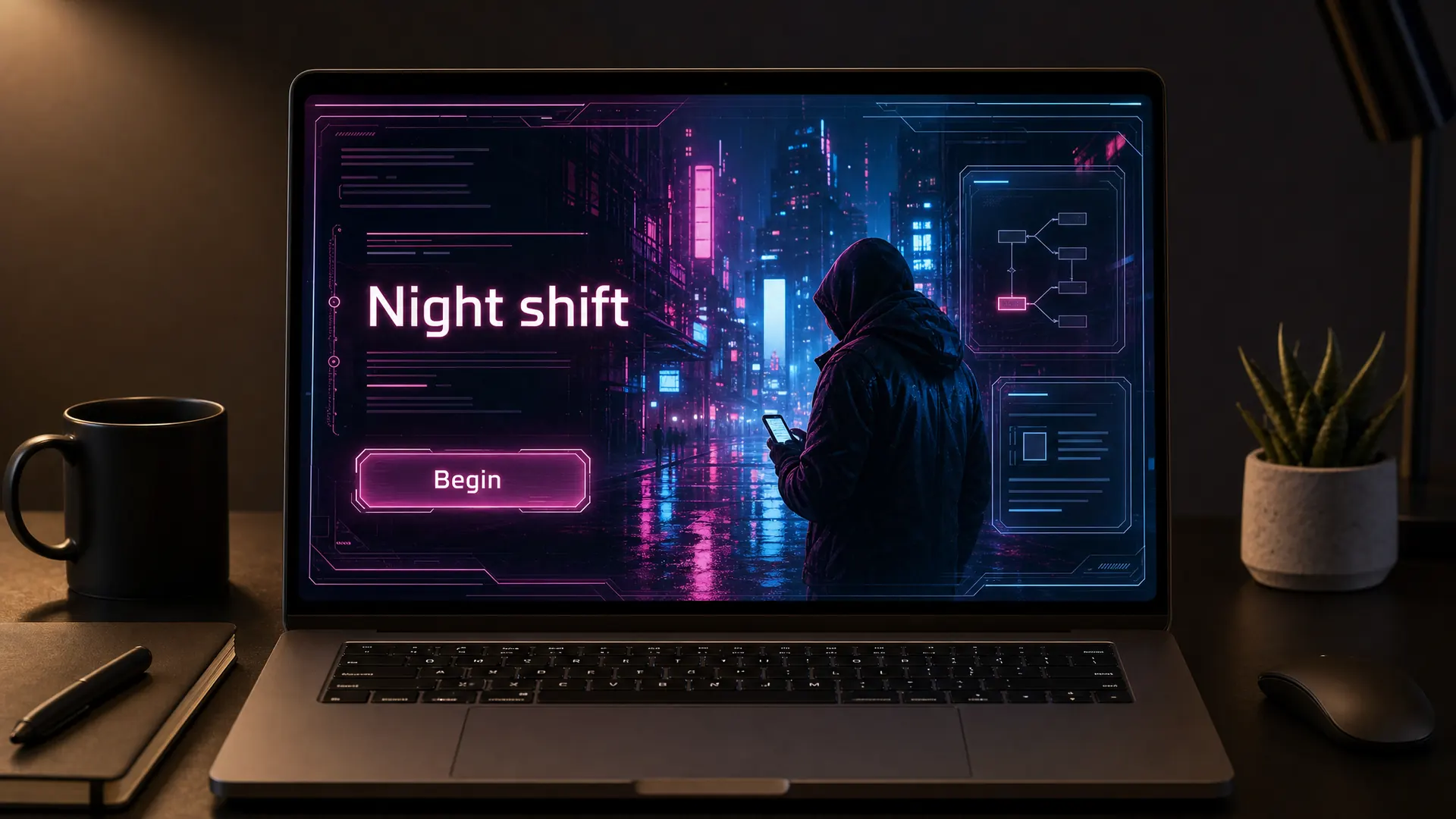
Cyberpunk is a rain-soaked city at night: neon signs in magenta and cyan, glowing screens and dense, high-tech streets. It feels tense and a little dangerous.
In a course
A branching scenario on cyber safety, where learners play the night-shift worker who has to spot the attack.
Try it this week
Set one scenario in a cyberpunk world. Check your neon text against the dark background for contrast.
The prompt for this picture
Photo for a training article. On a dark desk lit by one warm lamp, a laptop shows the opening screen of a branching cyber safety scenario designed in CYBERPUNK style: a rain-soaked city street at night, magenta and cyan neon signs reflected in puddles, a lone worker in a hooded jacket looking at a glowing phone, translucent holographic interface panels framing the scene. The title reads “Night shift” and a glowing button reads “Begin”. The neon signs carry no readable words. Spell the quoted words exactly. Show all other small text as unreadable placeholder lines. Realistic devices, no logos.
Week 5 of 52
No. 48 Synthwave
Origin Began as a music genre in the mid to late 2000s. The 2011 film Drive shaped its neon look.
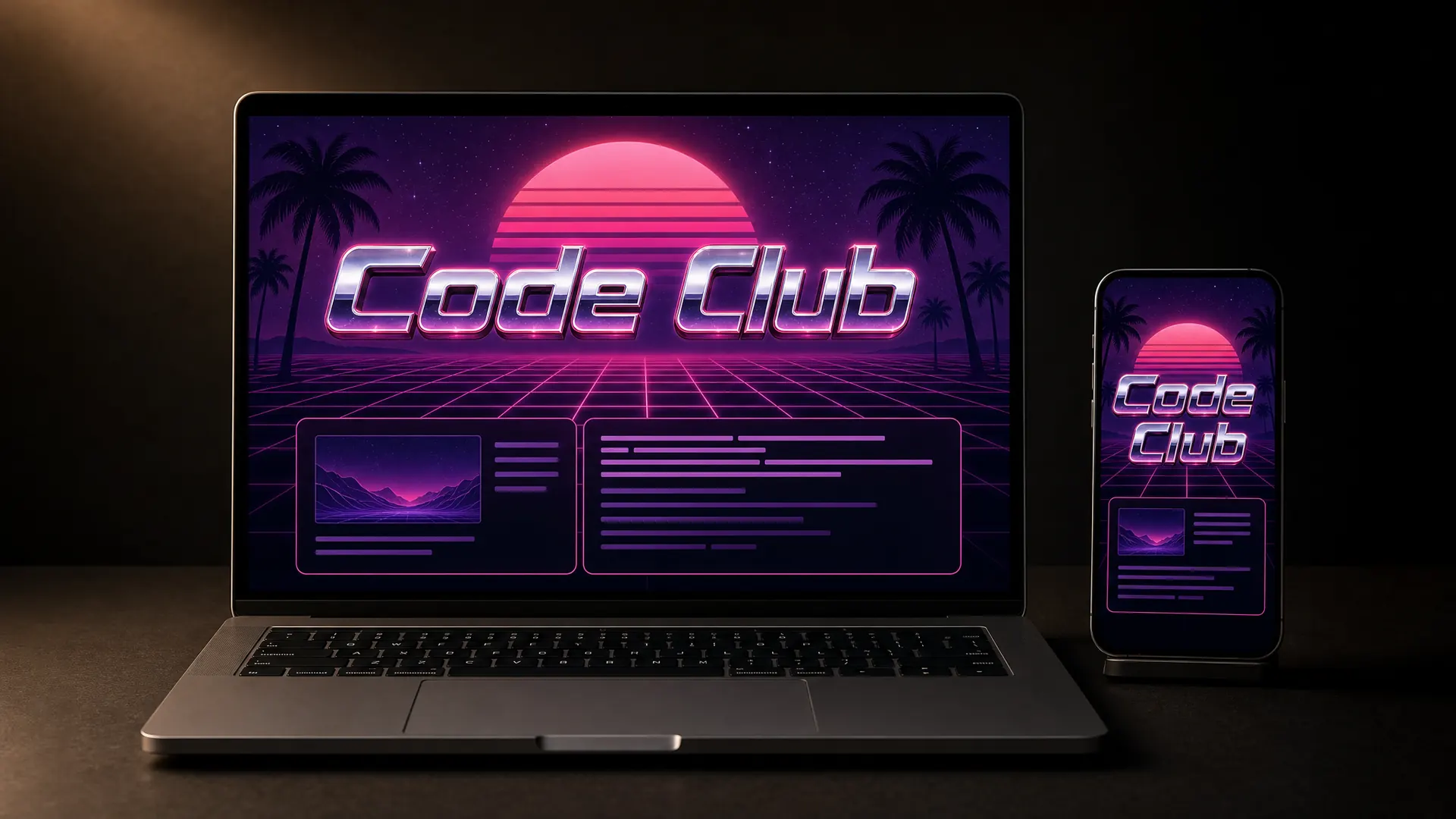
Synthwave borrows the 1980s idea of the future: a neon sunset, a glowing grid running to the horizon and chrome lettering in pink and purple.
In a course
The trailer or title screen for a coding club, a gaming course or anything with a retro arcade feel.
Try it this week
Make a synthwave cover for your course and see whether your learners smile or wince.
The prompt for this picture
Photo for a training article. On a dark desk lit by one warm lamp, a laptop and a smartphone stand side by side, both showing the title screen of a coding club course designed in SYNTHWAVE style: a neon pink and purple sunset striped with horizontal bands, a glowing magenta wireframe grid floor running to the horizon, palm silhouettes, chrome lettering with a pink glow. The title reads “Code Club”. Spell the quoted words exactly. Show all other small text as unreadable placeholder lines. Realistic devices, no logos.
Week 6 of 52
No. 47 Steampunk
Origin K. W. Jeter coined the word in 1987 as a play on cyberpunk.
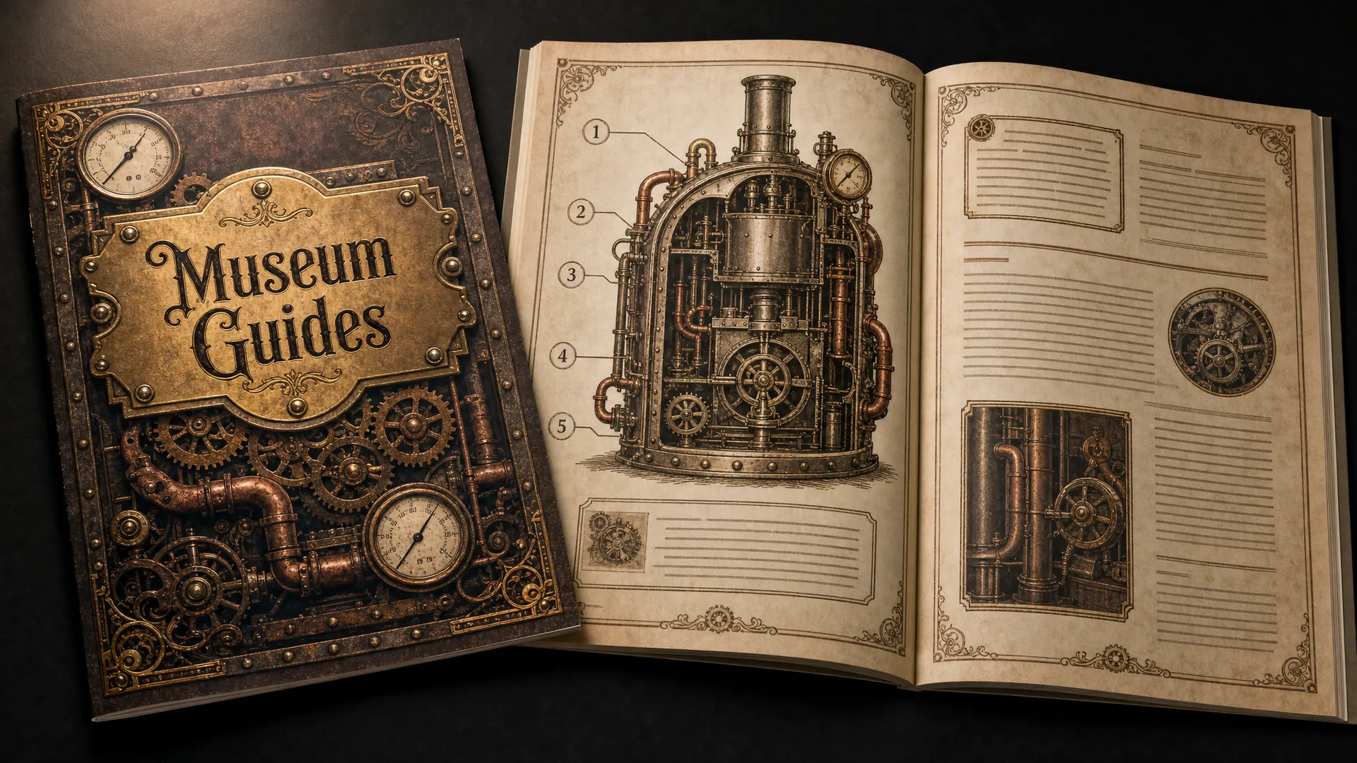
Steampunk imagines Victorian engineering pushed into the future. Think brass gears, copper pipes, gauges and rivets, drawn like old engravings on aged paper.
In a course
Workbooks and induction for museum guides, heritage railway volunteers or a historical society.
Try it this week
Design one printed cover in steampunk. Keep the inside pages plain enough to write on.
The prompt for this picture
Photo for a training article. On a dark desk lit by one warm lamp, a printed A4 training workbook lies open beside its closed cover, for a museum volunteer guide course. Both are designed in STEAMPUNK style: Victorian engraving-style illustrations of brass gears, copper pipes, pressure gauges and riveted metal plates, ornate filigree borders, aged parchment paper with brass, copper and deep brown ink. The cover title reads “Museum Guides” in an ornate Victorian display typeface inside a riveted brass nameplate. The open spread shows a cutaway engraving of a machine with numbered callouts. Spell the quoted words exactly. Show all other small text as unreadable placeholder lines. Realistic devices, no logos.
Week 7 of 52
No. 46 Maximalism
Origin Art historian Robert Pincus-Witten used the term in the late 1970s for artists reacting against minimalism.
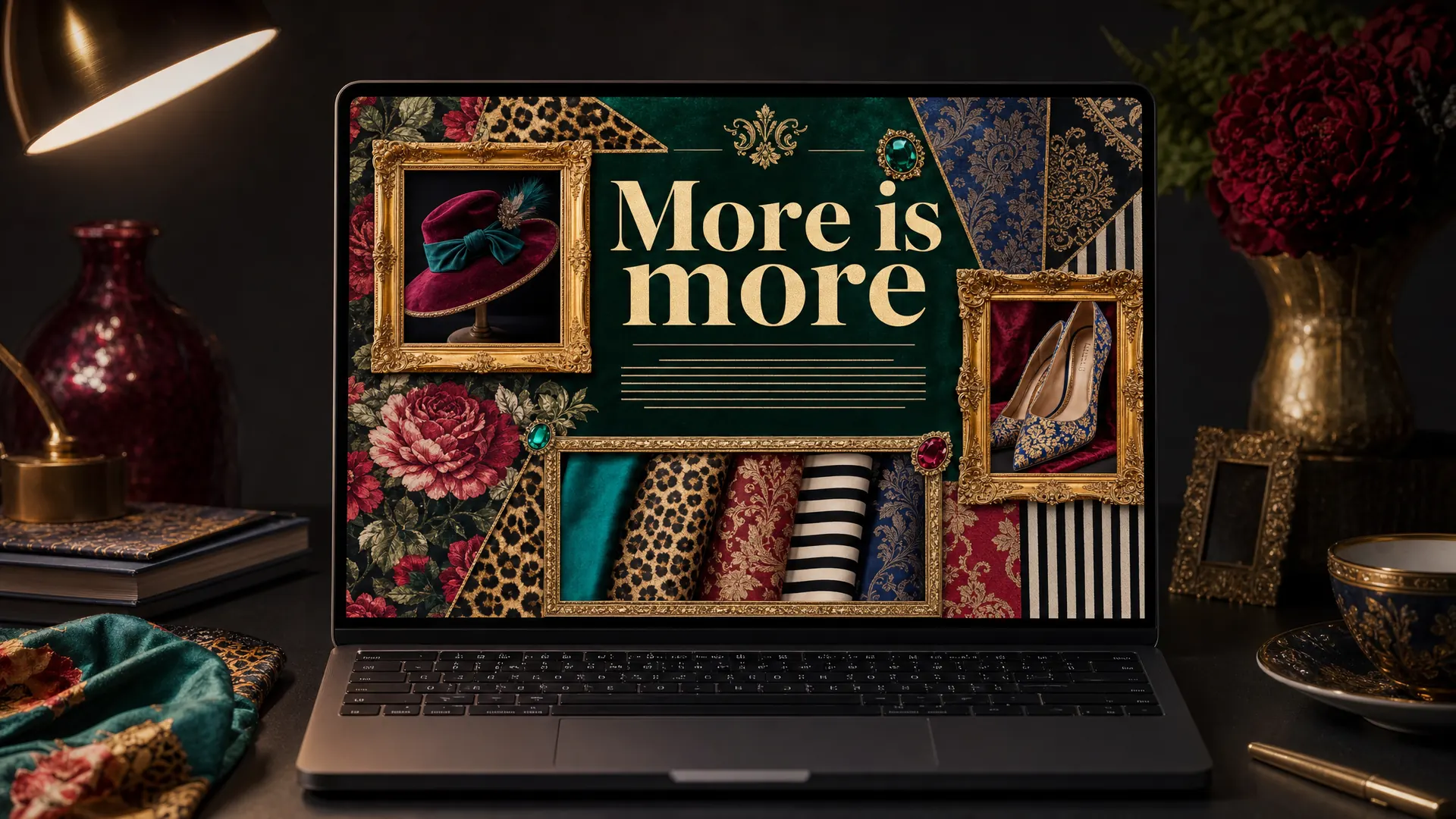
Maximalism says more is more: layered patterns, rich colours, ornate frames and lots of objects on the screen at once. Done well, it feels generous and personal.
In a course
A course about something you collect, style or make, like vintage fashion, interiors or flower arranging.
Try it this week
Build one maximalist welcome screen, then check every button is still easy to find.
The prompt for this picture
Photo for a training article. On a dark desk lit by one warm lamp, a laptop shows the welcome screen of a vintage fashion styling course designed in MAXIMALISM: layered patterns (florals, stripes, leopard print, damask), saturated jewel colours (emerald, ruby, sapphire, gold), ornate gilt frames around photos of hats, shoes and fabric swatches, a bold high-contrast serif heading, busy but carefully arranged. The heading reads “More is more”. Spell the quoted words exactly. Show all other small text as unreadable placeholder lines. Realistic devices, no logos.
Week 8 of 52
No. 45 Y2K aesthetic
Origin Based on products from the late 1990s and early 2000s, like the see-through iMac G3, and revived in the 2020s.
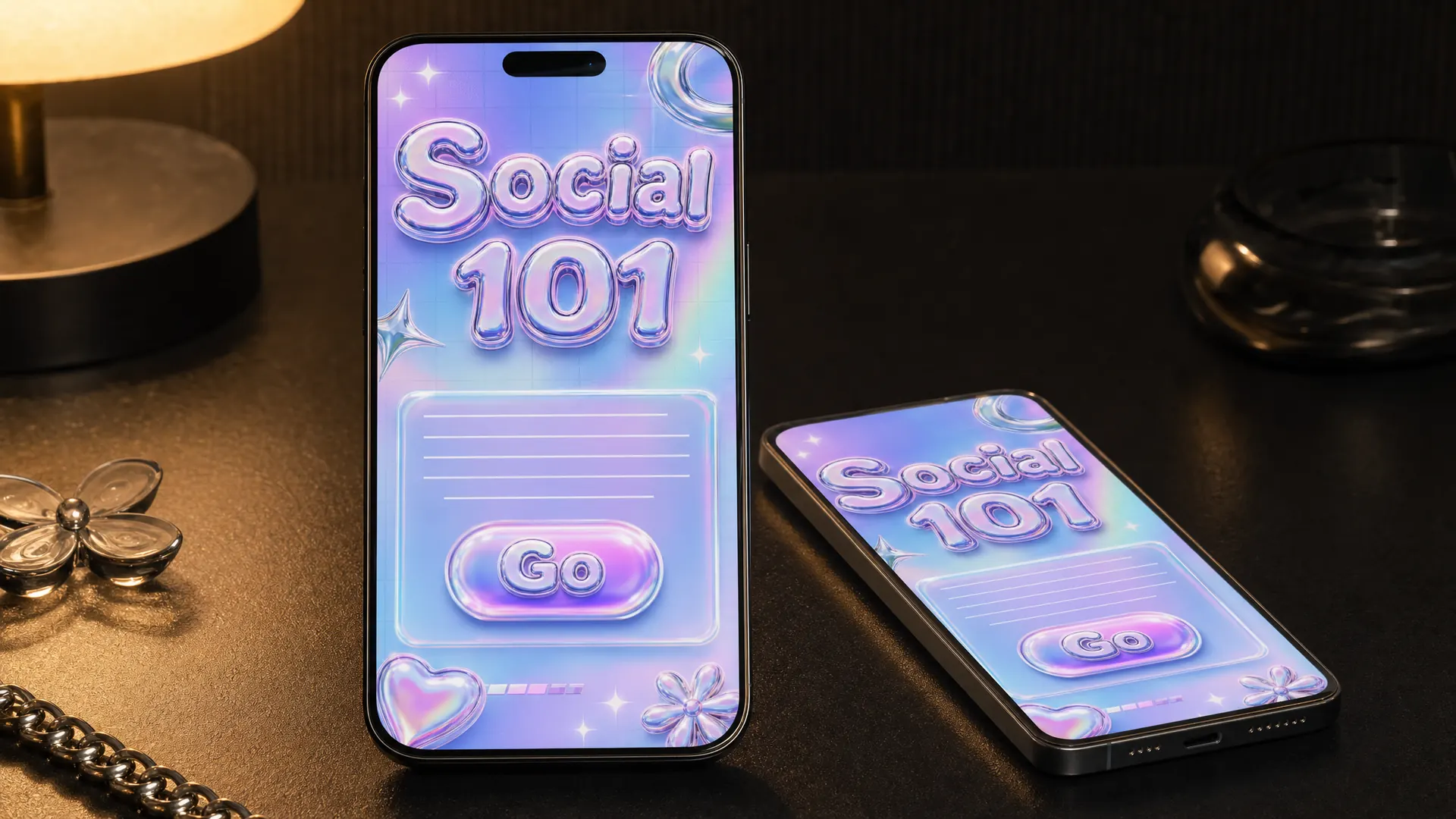
The Y2K look comes from the turn of the millennium: chrome, bubble letters, see-through jelly buttons, shimmering gradients and sparkles.
In a course
Short phone lessons for younger learners, on topics like social media or online safety.
Try it this week
Give one phone lesson Y2K buttons and headings. Keep the body text dark on light.
The prompt for this picture
Photo for a training article. On a dark desk lit by one warm lamp, a smartphone stands upright with a second phone lying beside it, both showing a social media basics micro-lesson designed in the Y2K AESTHETIC: chrome and iridescent metallic shapes, puffy bubble lettering, pastel holographic gradients, sparkle stars, translucent jelly-like buttons, early-2000s digital look. The title reads “Social 101” and a glossy button reads “Go”. Spell the quoted words exactly. Show all other small text as unreadable placeholder lines. Realistic devices, no logos.
Week 9 of 52
No. 44 Frutiger Aero
Origin Common from the mid-2000s to the early 2010s. It was named in 2018, after the Frutiger typeface and Microsoft’s Windows Aero.

Frutiger Aero is the glossy, optimistic look of computers in the mid-2000s: aqua glass buttons, bubbles, water drops, green fields and blue skies.
In a course
A course on gardening, water saving or the environment, where fresh and clean is the feeling you want.
Try it this week
Make one glossy aqua button and see if it brings back memories for your learners.
The prompt for this picture
Photo for a training article. On a dark desk lit by one warm lamp, a laptop shows a water-wise gardening course designed in FRUTIGER AERO style: glossy aqua and lime-green glass buttons, sky-blue gradients, water droplets and bubbles, soft lens flare, a lush green lawn under a bright blue sky, clean humanist sans-serif type, mid-2000s computer interface feel. The title reads “Water Wise”. Spell the quoted words exactly. Show all other small text as unreadable placeholder lines. Realistic devices, no logos.
Week 10 of 52
No. 43 Zine
Origin Mark Perry’s photocopied Sniffin’ Glue (London, 1976) is the best-known punk zine.
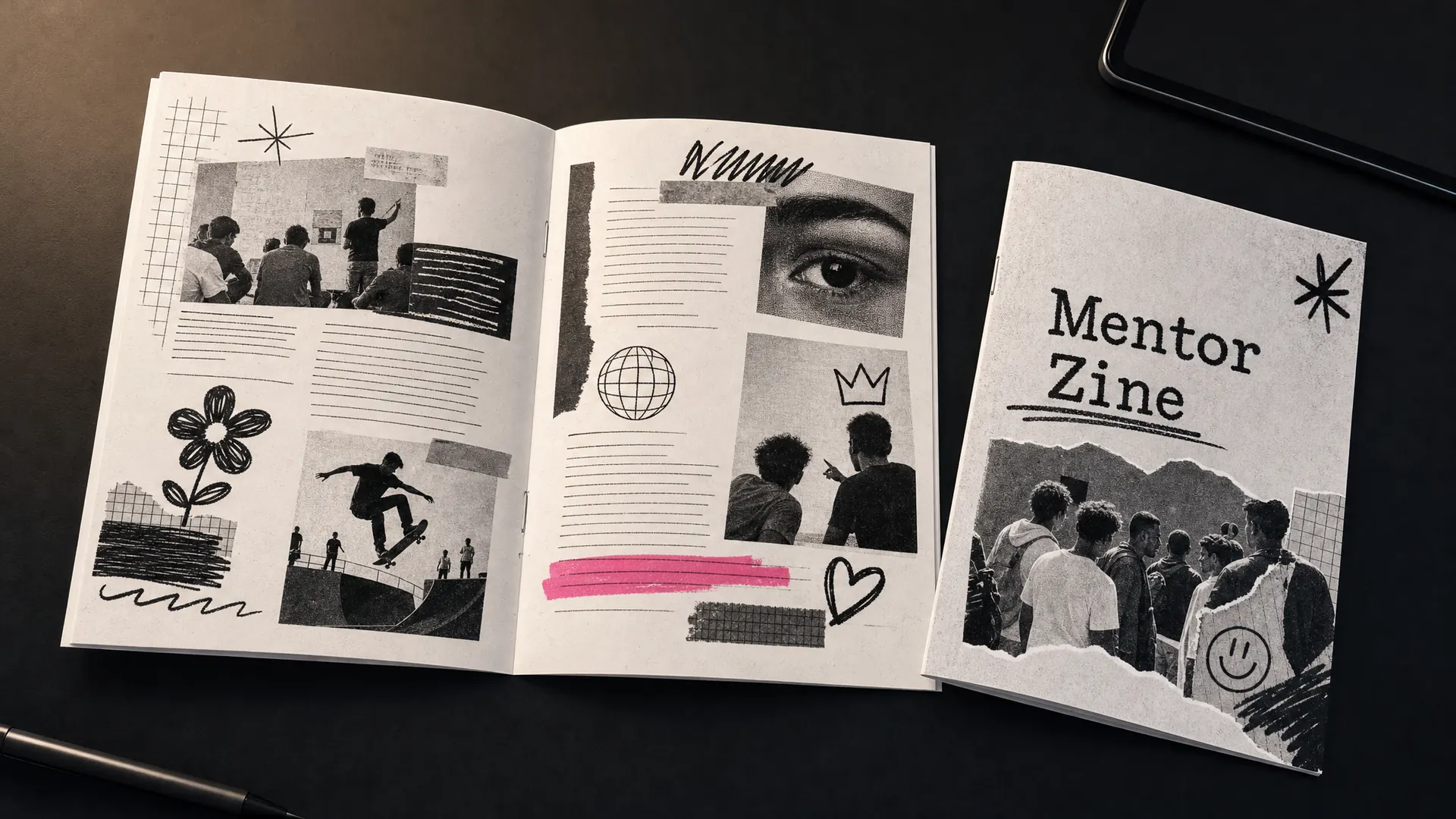
Zines are small, self-published booklets made with scissors, glue and a photocopier. Handwriting, typewriter text, stickers and cut-out pictures share the page.
In a course
A printed handout for a youth program, a community group or a peer mentoring course.
Try it this week
Turn one handout into a zine your learners could make themselves.
The prompt for this picture
Photo for a training article. On a dark desk lit by one warm lamp, a printed A5 photocopied zine lies open as a spread, with a second copy folded beside it, for a youth mentoring course. Designed as a DIY ZINE: black and white photocopy texture, cut-and-paste collage of photos and drawings, handwritten and typewriter text, stickers, a staple in the spine, one pink highlighter stroke. The cover reads “Mentor Zine”. Spell the quoted words exactly. Show all other small text as unreadable placeholder lines. Realistic devices, no logos.
Week 11 of 52
No. 42 Constructivism
Origin Founded in Russia around 1915 by Vladimir Tatlin and Alexander Rodchenko.
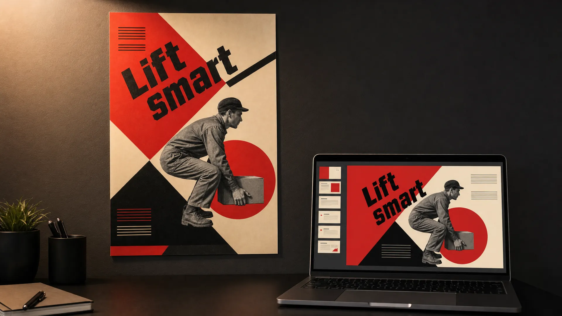
Constructivist posters use bold red, black and cream, strong diagonals, geometric blocks and photos cut into shapes. Everything points somewhere and pushes forward.
In a course
A safety campaign poster or a slide that has to rally people to act.
Try it this week
Redesign one safety message as a constructivist poster with one diagonal and one instruction.
The prompt for this picture
Photo for a training article. On a dark wall lit by one warm light, a printed safety campaign poster hangs on the wall and a laptop on the desk below shows the same design as a course slide. Designed in RUSSIAN CONSTRUCTIVISM style: bold red, black and cream, strong diagonals, geometric blocks and circles, a black-and-white photomontage of a worker lifting a box correctly with bent knees, blocky sans-serif type set at an angle. The words read “Lift smart”. Spell the quoted words exactly. Show all other small text as unreadable placeholder lines. Realistic devices, no logos.
Week 12 of 52
No. 41 Art Nouveau
Origin Popular from about 1890 to 1910. It’s named after Siegfried Bing’s Paris gallery, Maison de l’Art Nouveau (1895).
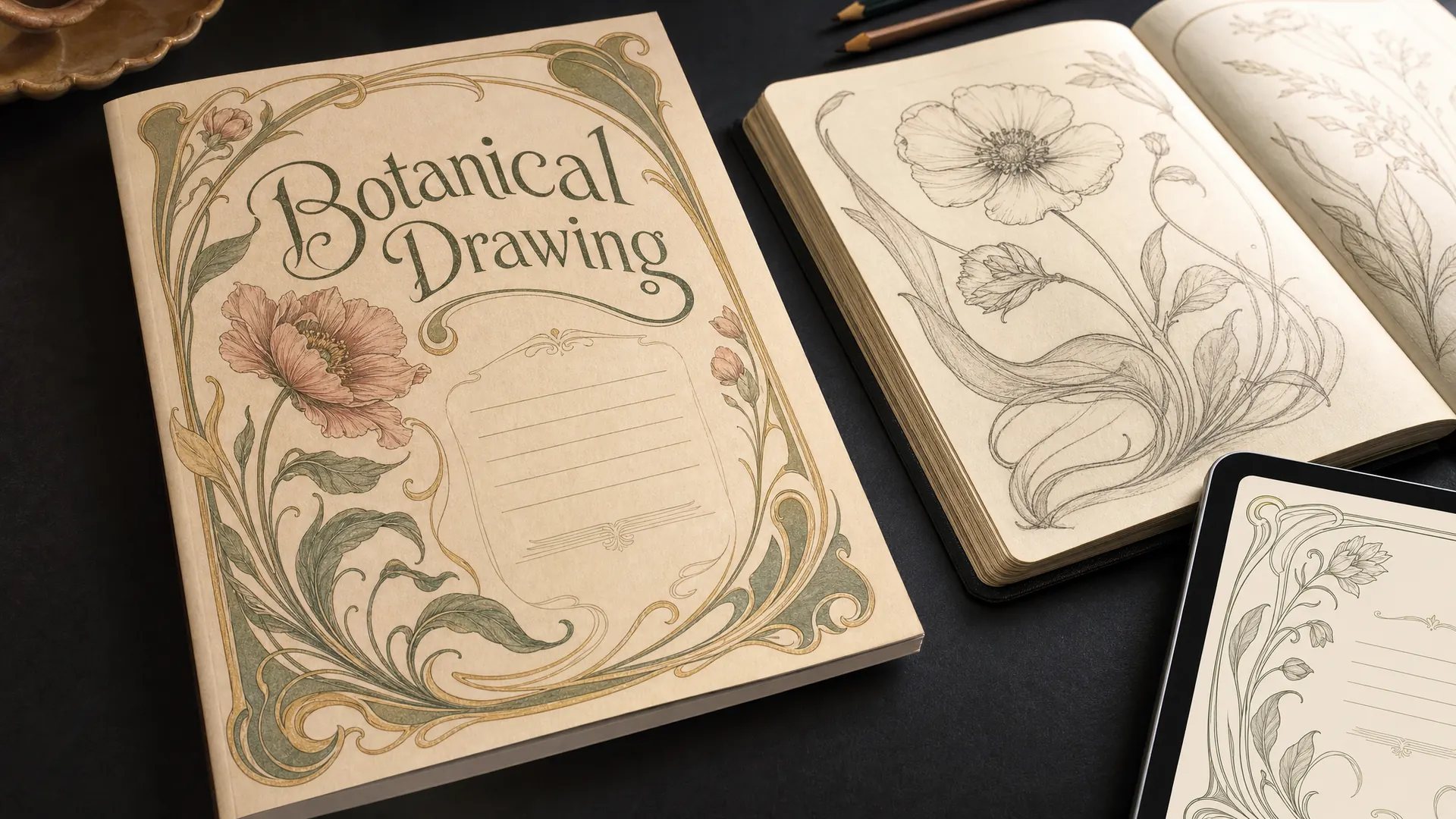
Art Nouveau is all flowing lines, flowers, vines and ornate frames, with hand-drawn lettering that curves to fit the space.
In a course
The cover of a course on botanical drawing, floristry, calligraphy or perfume making.
Try it this week
Frame your course title with an Art Nouveau border. Leave the lessons uncluttered.
The prompt for this picture
Photo for a training article. On a dark desk lit by one warm lamp, a printed workbook cover for a botanical drawing course lies beside an open sketchbook. Designed in ART NOUVEAU style: flowing whiplash curves, stylised flowers, vines and leaves, an ornate decorative frame border, muted gold, sage green and dusty rose on cream paper, curved hand-drawn lettering. The title reads “Botanical Drawing”. Spell the quoted words exactly. Show all other small text as unreadable placeholder lines. Realistic devices, no logos.
Week 13 of 52
No. 40 Pop art
Origin Emerged in Britain in the mid-1950s and in the US in the late 1950s, with Andy Warhol as its central figure.
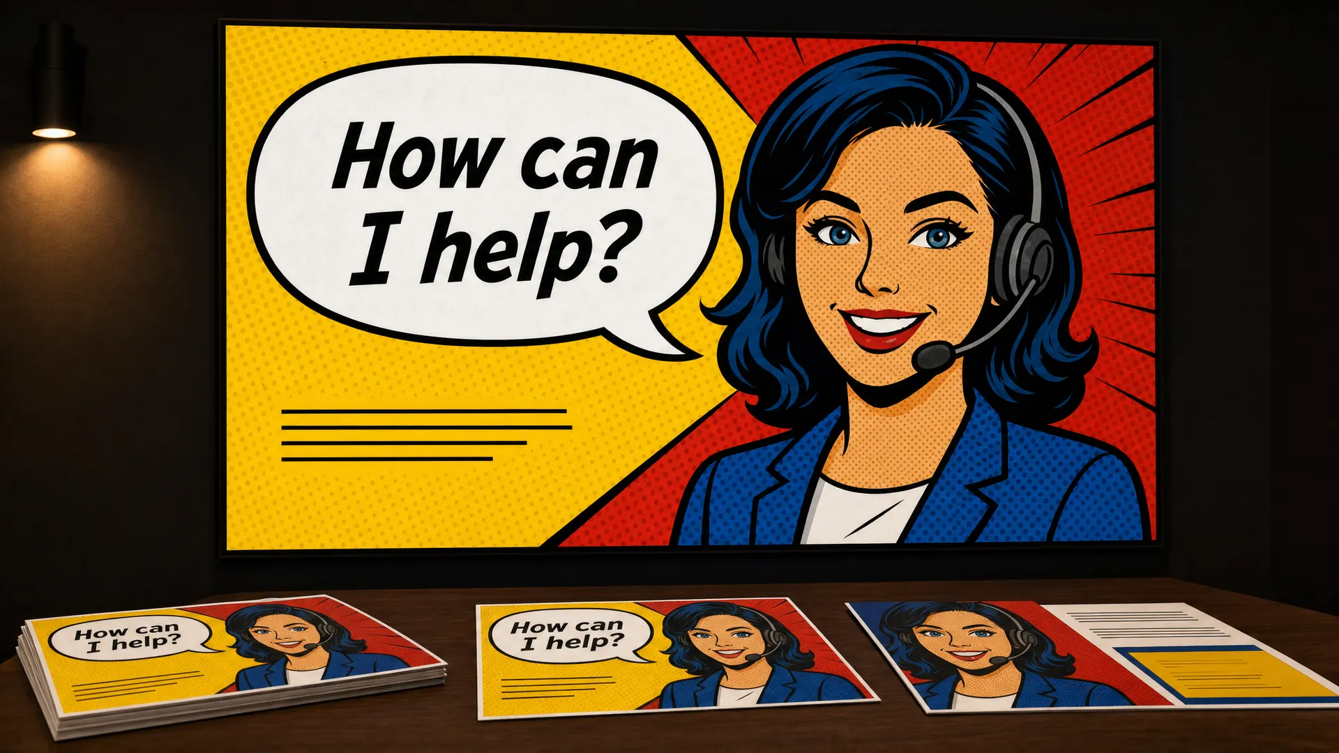
Pop art borrows from comics and advertising: thick black outlines, flat primary colours, halftone dots and bold speech bubbles.
In a course
Customer service training, where one big speech bubble carries the line learners need to remember.
Try it this week
Turn your most important phrase into a pop art speech bubble.
The prompt for this picture
Photo for a training article. In a dim training room lit by one warm light, a large wall screen shows a customer service training slide, with printed cards in the same style on the table in front. Designed in POP ART style: bold primary colours, thick black outlines, Ben-Day halftone dots, an original comic-style illustration of a smiling customer service worker wearing a headset, and a large speech bubble. The speech bubble reads “How can I help?”. Spell the quoted words exactly. Show all other small text as unreadable placeholder lines. Realistic devices, no logos.
Between the weeks
Characters make it stick
A lot of the styles in this countdown use characters, and for good reason. A character gives learners someone to follow. Put a problem in front of a character and learners start predicting what they’ll do next, which is the kind of thinking you want. A learner might forget a list of five steps, but they’ll remember the volunteer who skipped step three and what happened next.
Characters work in almost any style here: flat, comic, clay, picture book, even pixel art. Give them a name, a job your learners recognise and a problem worth solving. Keep the same cast across the whole course so learners get to know them. If you sell more than one course, your cast can become part of your brand.
Quarter 2, weeks 14 to 26
Mood setters
Week 14 of 52
No. 39 Retrofuturism
Origin Shows the future as earlier eras imagined it. Film critic Pauline Kael called the film Brazil a retro-futurist fantasy in 1986.
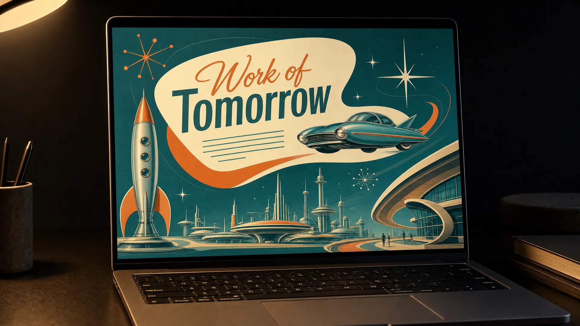
Retrofuturism shows the future as people imagined it in the 1950s and 60s: rockets, flying cars, atomic starbursts and boomerang shapes in turquoise and orange.
In a course
A course about the future of work, new technology or change, told with a wink.
Try it this week
Picture your topic in 2070, drawn as if it were 1960.
The prompt for this picture
Photo for a training article. On a dark desk lit by one warm lamp, a laptop shows the title screen of a course about the future of work designed in RETROFUTURISM style: a 1950s space-age vision of tomorrow with a sleek rocket, a flying car above a gleaming city, atomic starbursts and boomerang shapes, turquoise, orange and cream, chrome trim, a mid-century script and sans-serif heading. The title reads “Work of Tomorrow”. Spell the quoted words exactly. Show all other small text as unreadable placeholder lines. Realistic devices, no logos.
Week 15 of 52
No. 38 Low poly
Origin Began as a technical limit on 1990s games consoles and was later chosen as an art style.
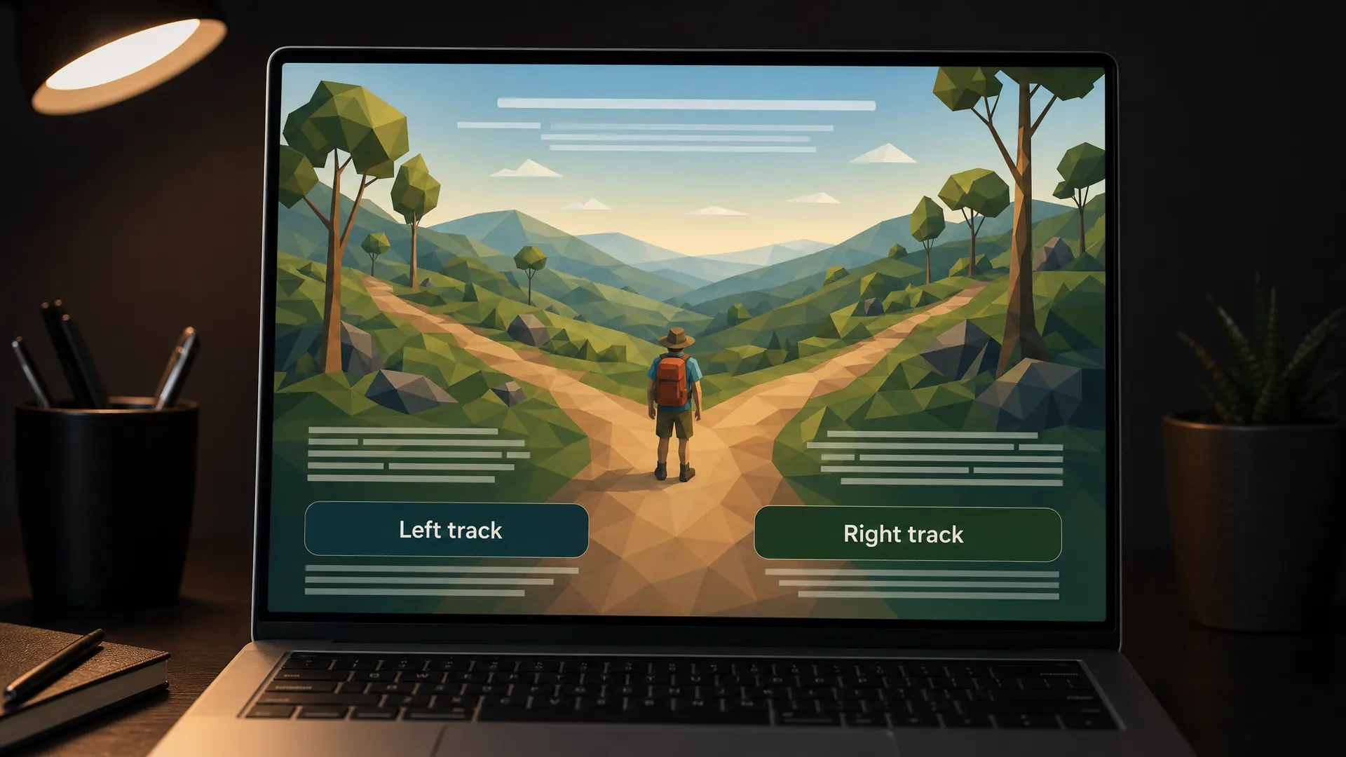
Low poly builds 3D scenes from a small number of flat-shaded triangles. Landscapes, buildings and people look faceted, simple and modern.
In a course
A 3D scenario on bushwalking safety or finding your way around a site, where learners pick a path.
Try it this week
Use a low poly landscape behind one decision point.
The prompt for this picture
Photo for a training article. On a dark desk lit by one warm lamp, a laptop shows a decision point in a bushwalking safety scenario designed in LOW POLY 3D style: a landscape of rolling hills, eucalyptus trees and a forked walking trail built from flat-shaded triangles, a soft gradient sky, a small low-poly hiker with a backpack at the fork. Two buttons read “Left track” and “Right track”. Spell the quoted words exactly. Show all other small text as unreadable placeholder lines. Realistic devices, no logos.
Week 16 of 52
No. 37 Neumorphism
Origin The name, a blend of neo and skeuomorphism, appeared in 2019 after a soft-shadow banking app concept by Alexander Plyuto spread online.
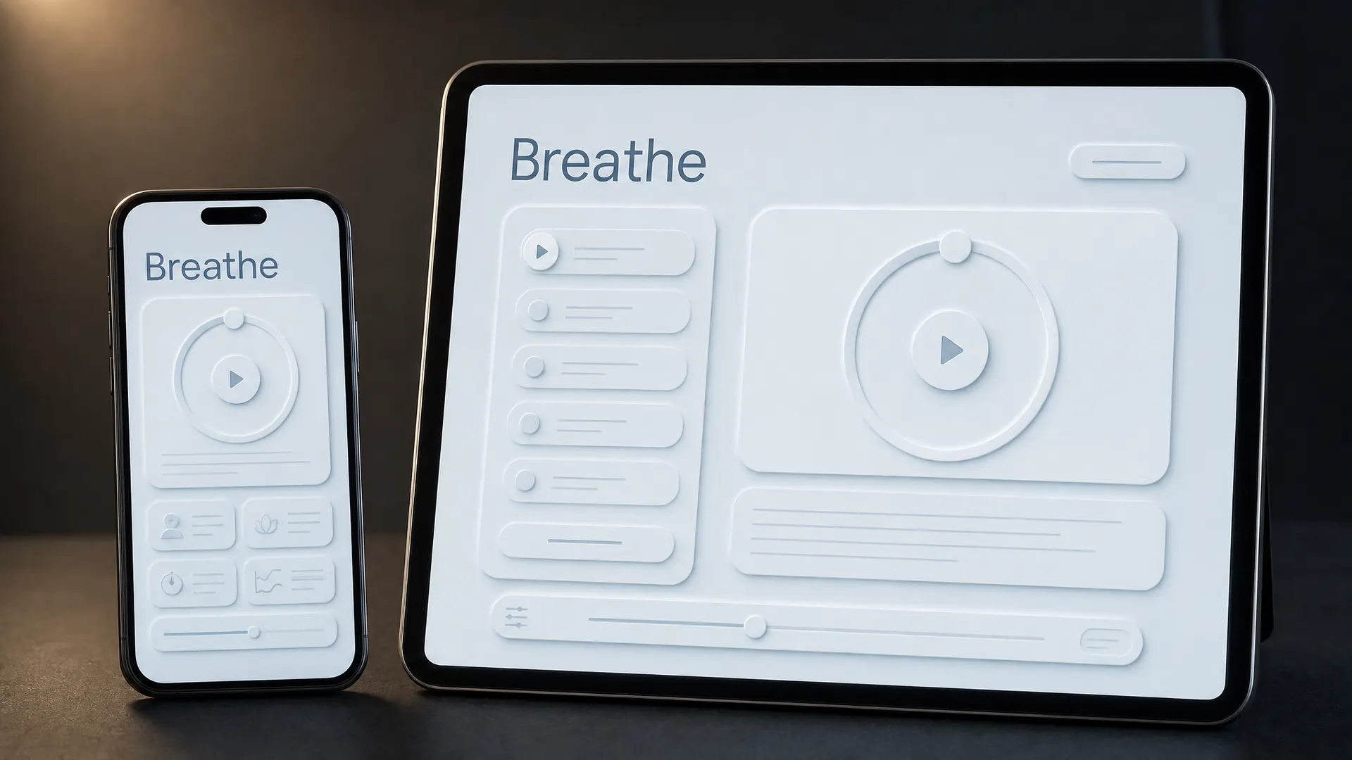
Neumorphism makes buttons look pressed into or raised out of the background, using soft light and shadow in a single colour. It feels calm and tactile.
In a course
A meditation or wellbeing course with only a few controls. Its low contrast makes it a poor choice for busy screens, so test it with your learners first.
Try it this week
Make one soft button, then run it through a free contrast checker.
The prompt for this picture
Photo for a training article. On a dark desk lit by one warm lamp, a smartphone and a tablet stand side by side showing a meditation basics course designed in NEUMORPHISM (soft UI): every button, slider and card is the same pale grey-blue as the background and looks gently extruded or pressed in using soft light and shadow, rounded corners, a circular play button, a breathing timer ring. The heading reads “Breathe”. Spell the quoted words exactly. Show all other small text as unreadable placeholder lines. Realistic devices, no logos.
Week 17 of 52
No. 36 De Stijl
Origin A Dutch movement founded in 1917 by Theo van Doesburg, Piet Mondrian and others. The name means The Style.
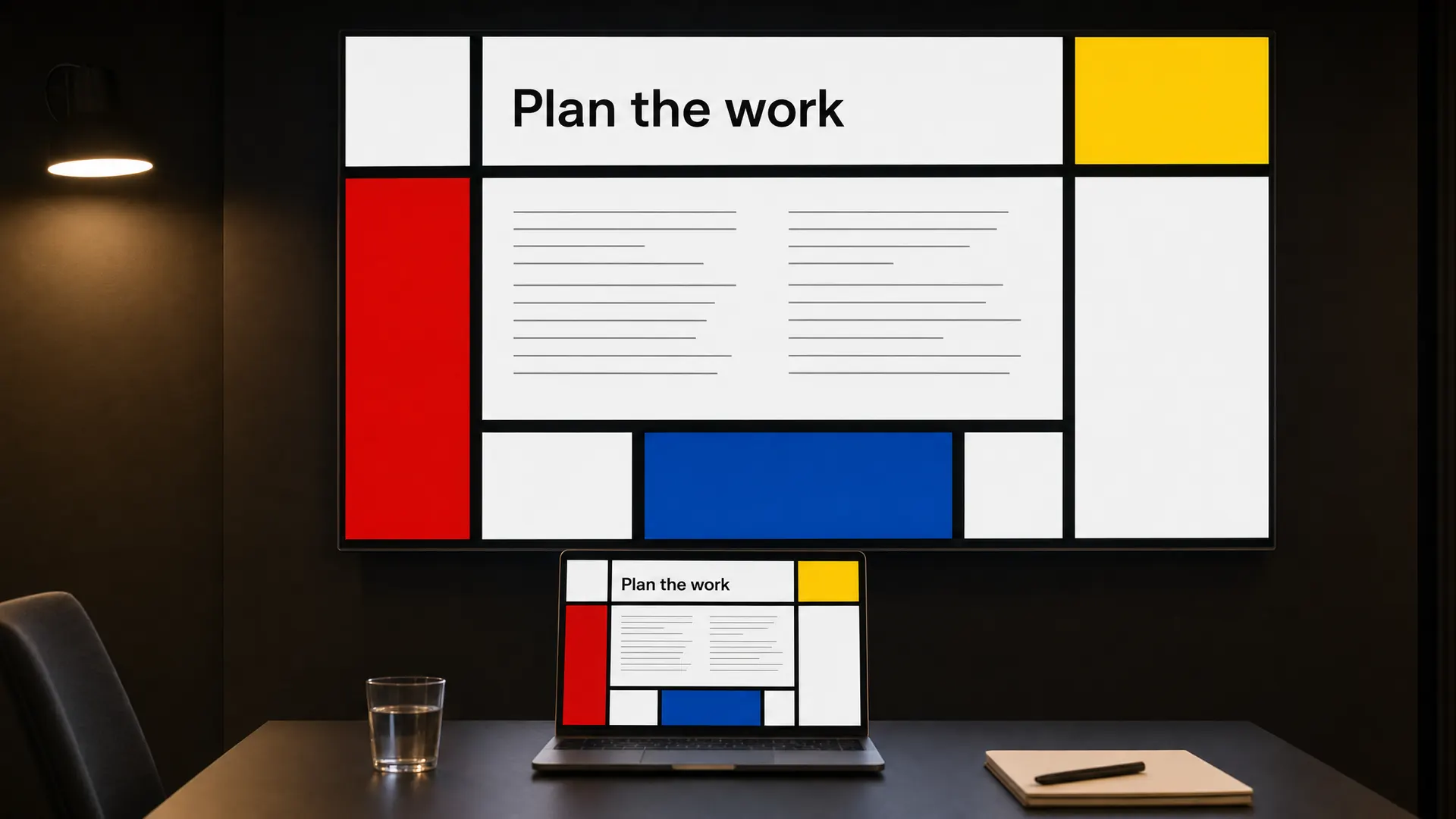
De Stijl uses only straight black lines, rectangles and the primary colours red, yellow and blue, with plenty of white.
In a course
A slide deck on project planning, where each coloured block holds one stage.
Try it this week
Lay out one process slide on a De Stijl grid.
The prompt for this picture
Photo for a training article. In a dim training room lit by one warm light, a large wall screen shows a project planning slide and a laptop on the table in front shows the same deck. Designed in DE STIJL style: an original asymmetric grid of thick black horizontal and vertical lines with rectangles of pure red, yellow, blue and lots of white, text set in the white rectangles in a plain sans-serif. The heading reads “Plan the work”. Spell the quoted words exactly. Show all other small text as unreadable placeholder lines. Realistic devices, no logos.
Week 18 of 52
No. 35 Memphis design
Origin Ettore Sottsass founded the Memphis Group, an Italian design group, in December 1980. It was named after a Bob Dylan song.
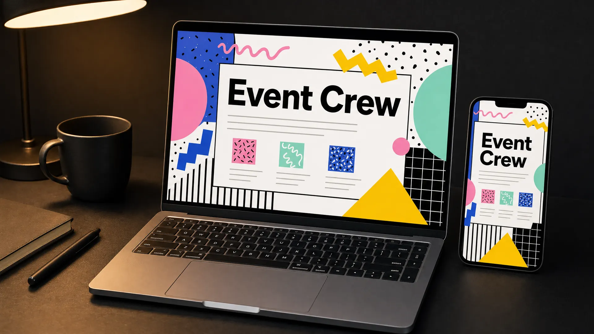
Memphis design is the 1980s at full volume: squiggles, zigzags, confetti patterns and bold shapes in clashing pastels and primaries.
In a course
Event volunteer training, party planning or anything that should feel fun from the first screen.
Try it this week
Add Memphis shapes to your title screen and nowhere else.
The prompt for this picture
Photo for a training article. On a dark desk lit by one warm lamp, a laptop and a smartphone show the welcome screen of an event volunteer course designed in MEMPHIS DESIGN style: squiggles, zigzags, confetti and terrazzo patterns, bold geometric shapes, clashing pastels and primaries (pink, mint, yellow, cobalt), black and white grid and stripe patterns. The heading reads “Event Crew”. Spell the quoted words exactly. Show all other small text as unreadable placeholder lines. Realistic devices, no logos.
Week 19 of 52
No. 34 Kawaii
Origin Kawaii culture grew in 1970s Japan, from rounded cute handwriting to Hello Kitty (1974).
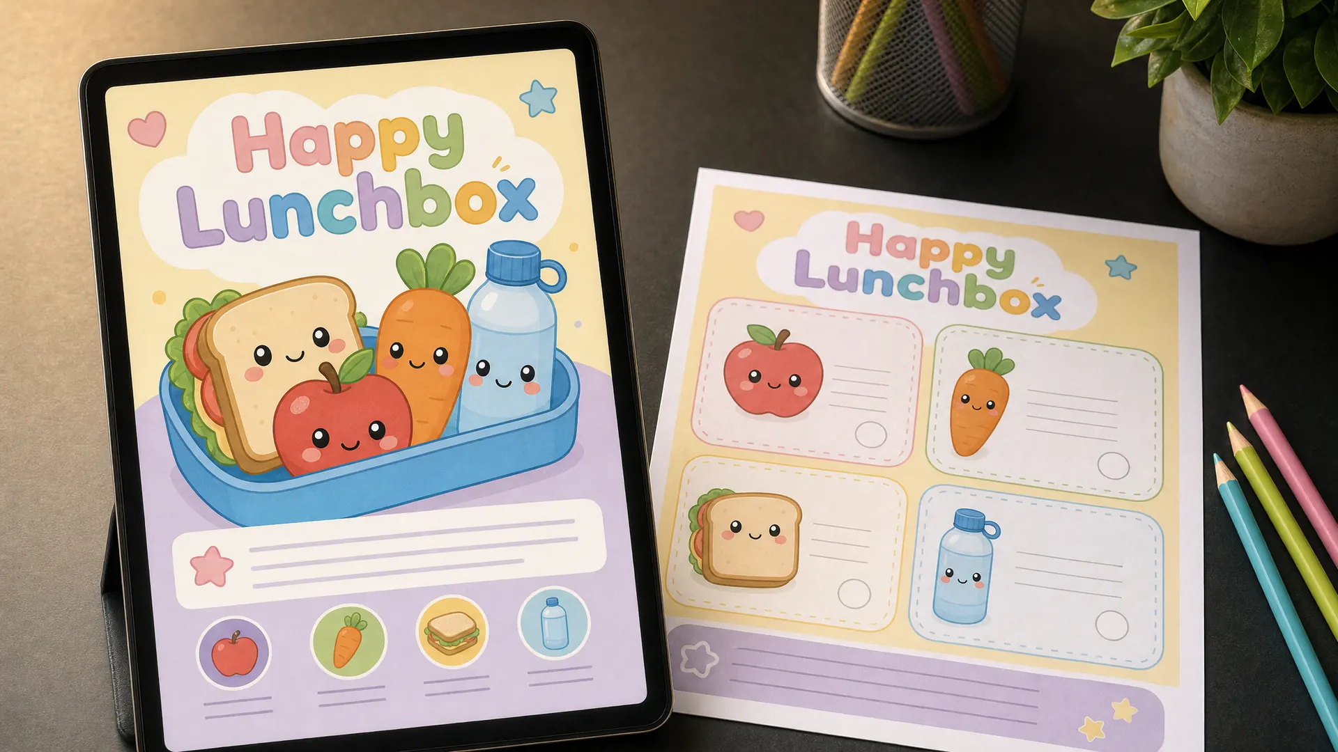
Kawaii is Japanese cute: rounded shapes, pastel colours and characters with tiny faces, from fruit to clouds to cups of tea.
In a course
A course for children, or for the adults who teach them, such as a healthy lunchbox program.
Try it this week
Give one everyday object in your course a tiny kawaii face.
The prompt for this picture
Photo for a training article. On a dark desk lit by one warm lamp, a tablet stands next to a printed activity sheet, both showing a healthy lunchbox course for children designed in KAWAII style: cute rounded fruit and vegetable characters (an apple, a carrot, a sandwich, a water bottle) with tiny happy faces and blushing cheeks, soft pastel colours, rounded shapes, bubbly type. The title reads “Happy Lunchbox”. Spell the quoted words exactly. Show all other small text as unreadable placeholder lines. Realistic devices, no logos.
Week 20 of 52
No. 33 Solarpunk
Origin The name comes from a 2008 blog post. The look spread through concept art shared online in 2014.
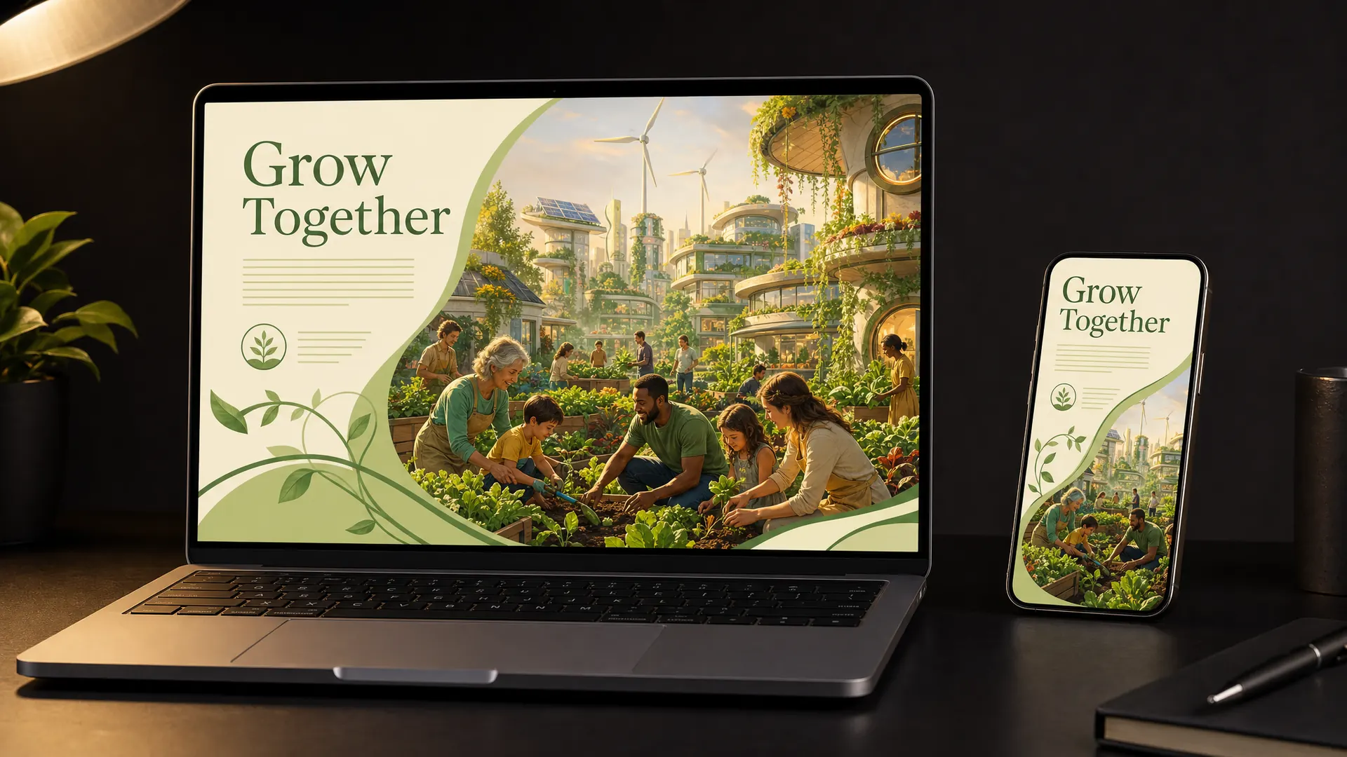
Solarpunk pictures a hopeful green future: rooftop gardens, solar panels, warm light and communities working together.
In a course
A community garden course, sustainability training or anything about a better future.
Try it this week
Draw your topic’s best-case future as a solarpunk scene for your course cover.
The prompt for this picture
Photo for a training article. On a dark desk lit by one warm lamp, a laptop and a smartphone show the cover of a community garden course designed in SOLARPUNK style: a hopeful green future neighbourhood with rooftop vegetable gardens, solar panels and wind turbines, climbing plants on buildings, warm golden light, people of different ages planting together, organic curving shapes. The title reads “Grow Together”. Spell the quoted words exactly. Show all other small text as unreadable placeholder lines. Realistic devices, no logos.
Week 21 of 52
No. 32 Letterpress
Origin Johannes Gutenberg developed movable-type printing in Europe around 1440.
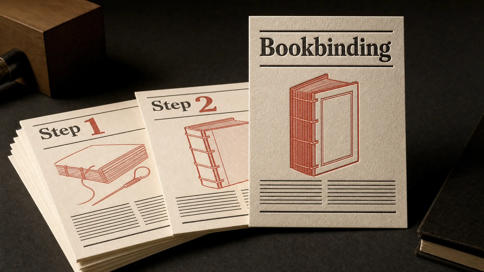
Letterpress prints from raised metal or wood type pressed into thick paper, leaving a slight dent and soft ink edges.
In a course
Printed workshop cards, certificates and invitations for a craft course.
Try it this week
Design one workshop card with letterpress-style type and two ink colours.
The prompt for this picture
Photo for a training article. On a dark desk lit by one warm lamp, a set of thick cotton-paper workshop cards for a bookbinding course is fanned out, with one card propped upright. Designed as LETTERPRESS printing: deeply debossed type pressed into the paper, slight ink spread at the edges, chunky wood-type numerals, two ink colours (black and brick red) on cream stock. The cards read “Bookbinding”, “Step 1” and “Step 2”. Spell the quoted words exactly. Show all other small text as unreadable placeholder lines. Realistic devices, no logos.
Week 22 of 52
No. 31 Woodcut and linocut
Origin Woodcut began in ancient China and developed in Europe around 1400. Linocut became popular in the 20th century.
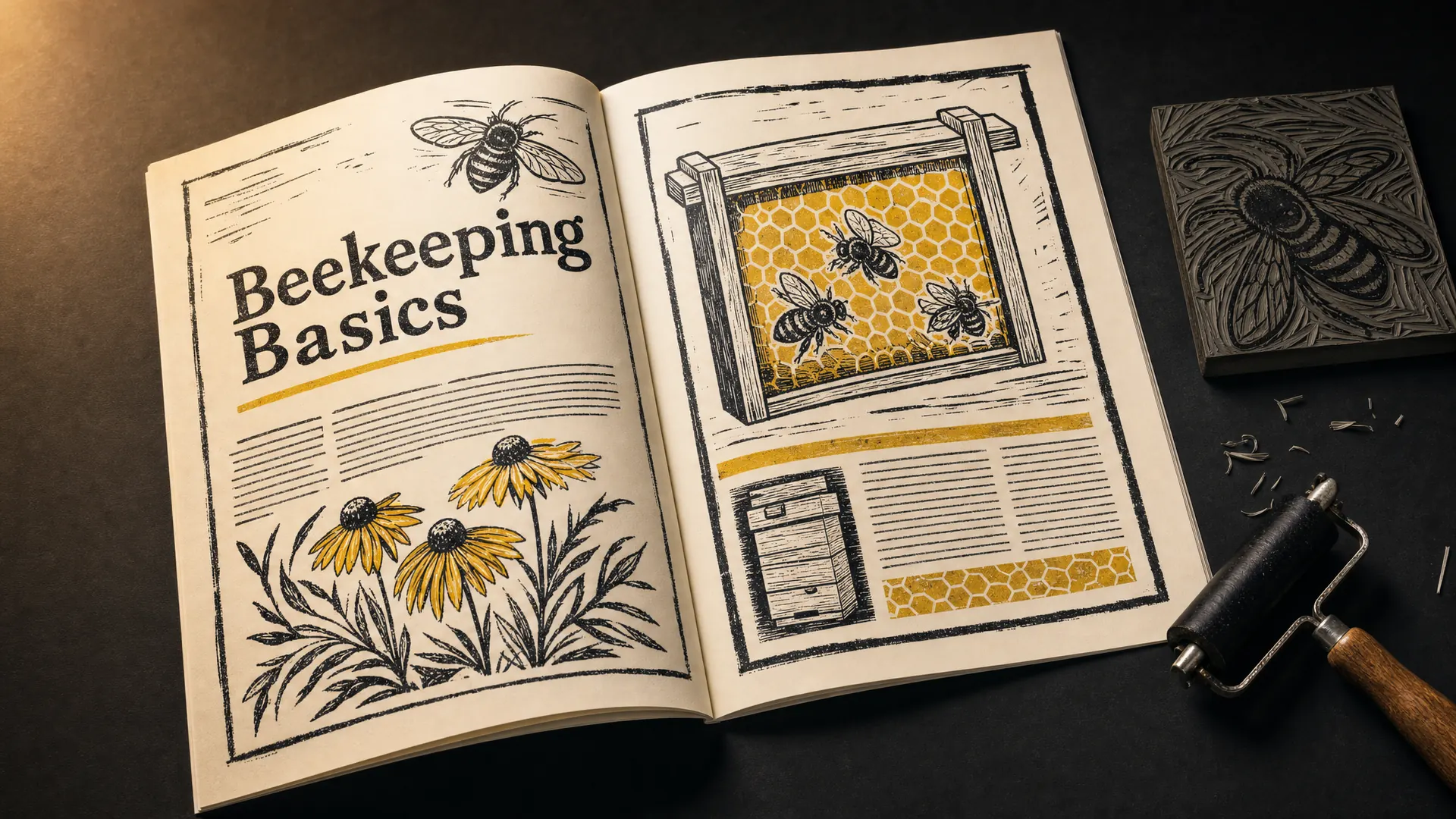
Woodcuts and linocuts are carved by hand, so every line is bold and every gouge mark shows. Most use black ink and one accent colour on cream paper.
In a course
Workbooks for a hands-on course, like beekeeping, gardening or woodwork.
Try it this week
Illustrate one step of your process in a linocut style.
The prompt for this picture
Photo for a training article. On a dark desk lit by one warm lamp, a printed workbook lies open, with a carved lino block and a brayer beside it, for a beekeeping basics course. Designed in WOODCUT and LINOCUT style: bold hand-carved black lines with visible gouge marks, illustrations of honey bees, a hive frame and flowers, cream paper, one honey-yellow accent colour. The heading reads “Beekeeping Basics”. Spell the quoted words exactly. Show all other small text as unreadable placeholder lines. Realistic devices, no logos.
Week 23 of 52
No. 30 Risograph
Origin Japan’s Riso Kagaku introduced the Risograph printer in 1980. Artists and zine makers took it up in the 2010s.
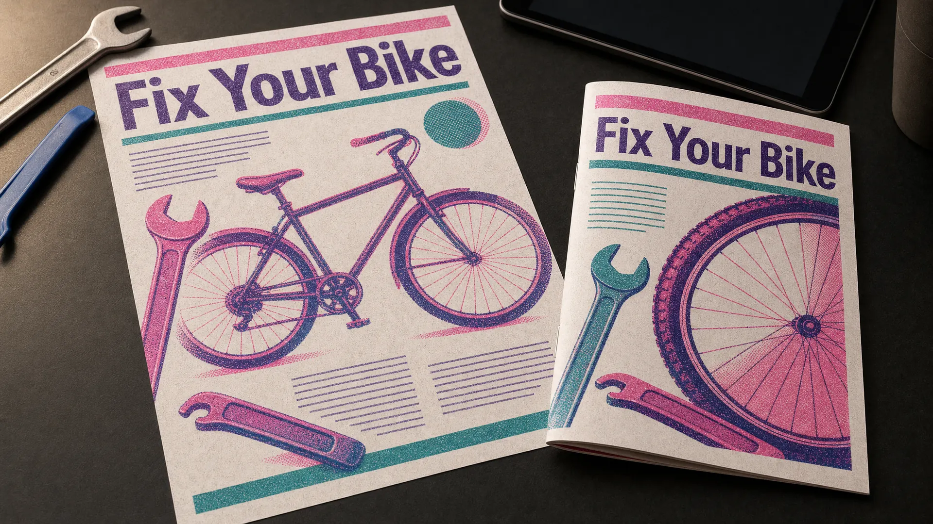
Risograph printing layers bright spot colours, like fluoro pink and teal, with visible grain and colours that don’t quite line up.
In a course
Handouts for a bike repair workshop, a community class or a creative course.
Try it this week
Limit one handout to two riso colours and let them overlap.
The prompt for this picture
Photo for a training article. On a dark desk lit by one warm lamp, a printed handout and a folded booklet for a bike repair workshop lie on the desk. Designed as RISOGRAPH prints: two spot colours, fluorescent pink and teal, overprinting to make a deep purple, visible grain and halftone texture, slight misregistration between the colours, chunky illustrations of a bicycle, spanner and tyre lever. The title reads “Fix Your Bike”. Spell the quoted words exactly. Show all other small text as unreadable placeholder lines. Realistic devices, no logos.
Week 24 of 52
No. 29 Duotone
Origin A printing technique that overprints two halftones in contrasting colours. Photoshop has a Duotone mode built in.
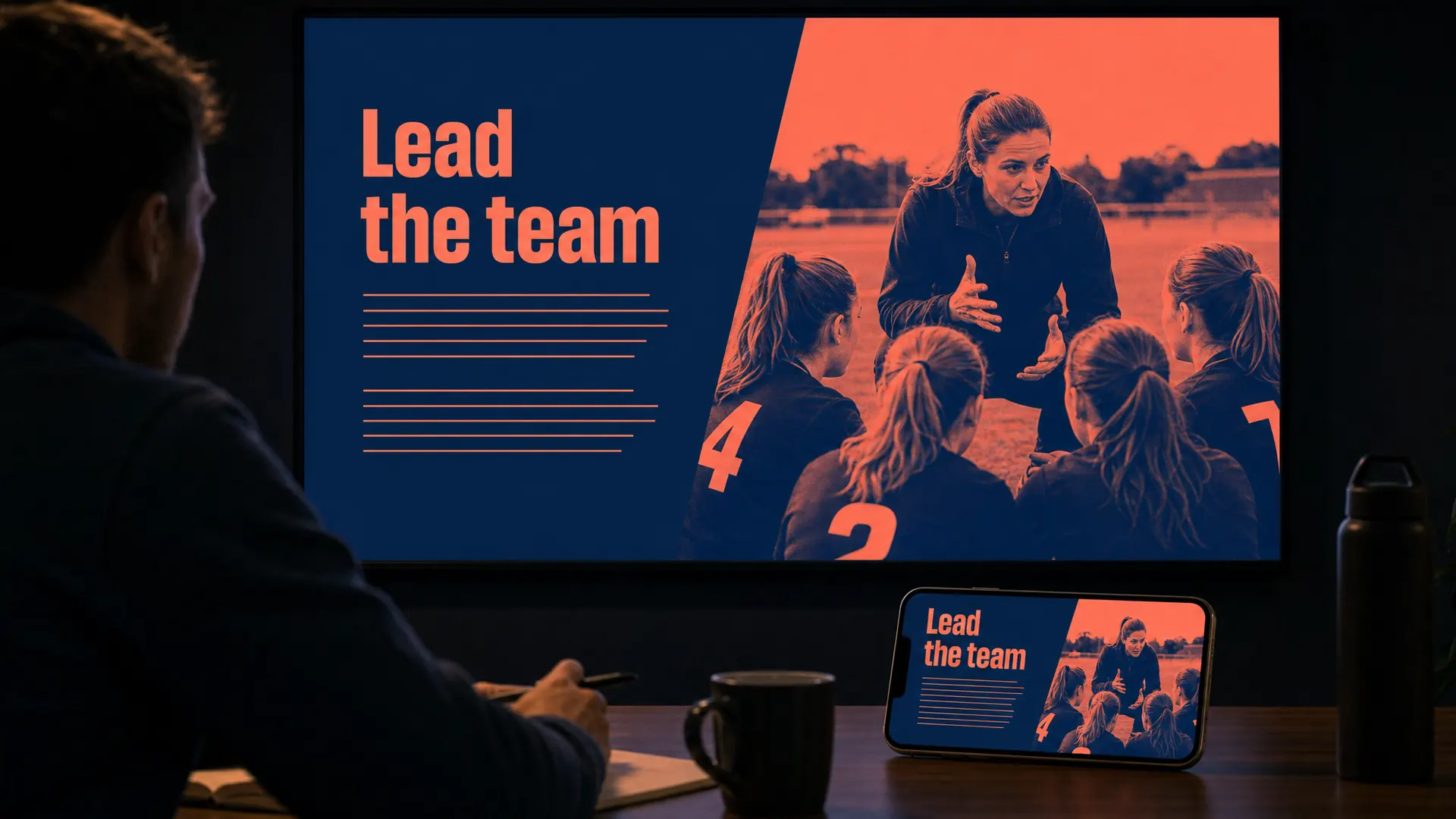
Duotone turns photos into two colours, such as deep navy and coral. It makes mismatched photos look like a set.
In a course
Leadership or club training that has to use whatever photos you already have.
Try it this week
Run all your course photos through one duotone pair.
The prompt for this picture
Photo for a training article. In a dim training room lit by one warm light, a large wall screen shows a leadership slide for sports club captains and a smartphone on the table shows the same lesson. Designed in DUOTONE style: photographs of people coaching and talking rendered in just two colours, deep navy blue and coral, with a bold sans-serif heading. The heading reads “Lead the team”. Spell the quoted words exactly. Show all other small text as unreadable placeholder lines. Realistic devices, no logos.
Week 25 of 52
No. 28 Art Deco
Origin Appeared in Paris in the 1910s and took its name from the 1925 Paris exhibition of decorative arts.
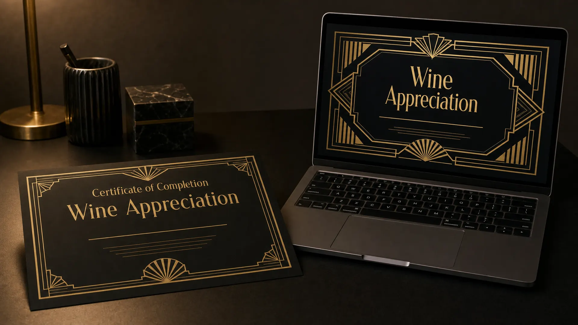
Art Deco is geometric glamour: gold and black, sunbursts, fan shapes, stepped frames and tall, elegant lettering.
In a course
The completion certificate for a wine, hospitality or events course.
Try it this week
Give your certificate an Art Deco frame. People print and keep certificates that look good.
The prompt for this picture
Photo for a training article. On a dark desk lit by one warm lamp, a printed certificate of completion lies beside a laptop showing the same design as the final screen of a wine appreciation course. Designed in ART DECO style: gold and black, geometric fan and sunburst motifs, stepped symmetrical frames, tall elegant capitals. The certificate reads “Certificate of Completion” and “Wine Appreciation”, and the name line is blank. Spell the quoted words exactly. Show all other small text as unreadable placeholder lines. Realistic devices, no logos.
Week 26 of 52
No. 27 Mid-century modern
Origin Most popular from about 1945 to 1970. Cara Greenberg’s 1984 book defined it as a movement.
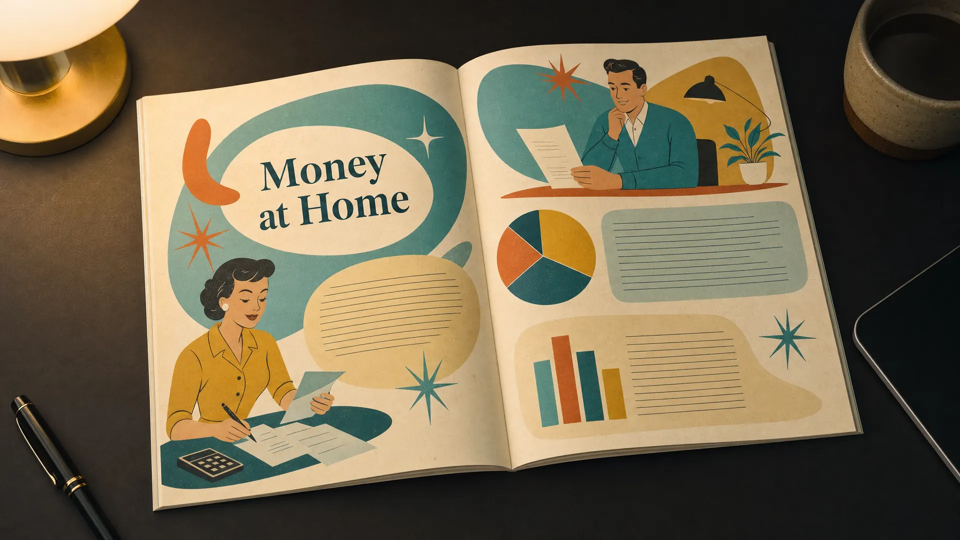
Mid-century modern graphics use simple stylised people, boomerangs and starbursts in mustard, teal and orange.
In a course
A friendly course on household money, cooking or home skills.
Try it this week
Draw your characters as simple mid-century figures for one workbook spread.
The prompt for this picture
Photo for a training article. On a dark desk lit by one warm lamp, a printed workbook lies open as a spread for a household budgeting course, designed in MID-CENTURY MODERN illustration style: simple stylised 1950s people with oval heads, atomic boomerangs and starbursts, organic shapes, mustard, teal, burnt orange and cream, slightly rough print texture. The heading reads “Money at Home”. Spell the quoted words exactly. Show all other small text as unreadable placeholder lines. Realistic devices, no logos.
Between the weeks
Playing around the edges of a style guide
If you build training for an organisation, you’ll usually start from its style guide: the logo, colours, fonts and rules for photos. We build style guides for our clients too, so all their courses look like they belong together.
A style guide doesn’t rule out everything on this list. Plenty of organisations let you play around the edges. You might keep the brand colours and fonts but use a comic layout for one scenario, a chalkboard look for a recipe module or a blueprint style for a technical how-to. Ask what’s fixed and what’s flexible before you start. There’s often more room than you expect.
Quarter 3, weeks 27 to 39
Strong characters and handmade looks
Week 27 of 52
No. 26 Bauhaus
Origin Walter Gropius founded the Bauhaus in Weimar, Germany, in 1919. It closed in 1933 under Nazi pressure.
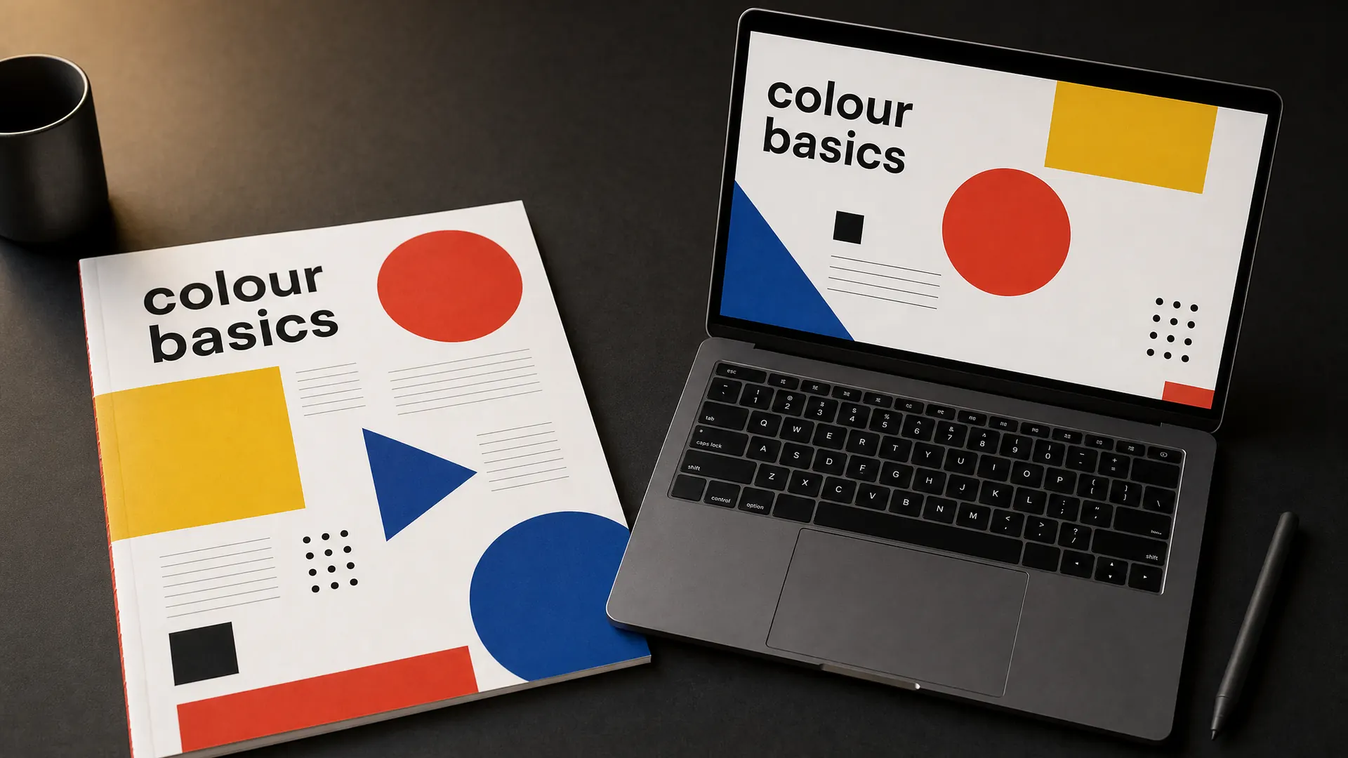
The Bauhaus look uses circles, squares and triangles in red, yellow, blue and black, on an uneven grid with plain sans-serif type.
In a course
A course on colour, art basics or design thinking.
Try it this week
Build one diagram from only a circle, a square and a triangle.
The prompt for this picture
Photo for a training article. On a dark desk lit by one warm lamp, a printed workbook page lies beside a laptop showing a slide from the same colour basics course. Designed in BAUHAUS style: bold circles, squares and triangles in red, yellow, blue and black, an asymmetric grid, geometric sans-serif type set in lowercase, generous white space. The heading reads “colour basics”. Spell the quoted words exactly. Show all other small text as unreadable placeholder lines. Realistic devices, no logos.
Week 28 of 52
No. 25 Corporate Memphis
Origin The agency Buck created it for Facebook in 2017 under the name Alegria.
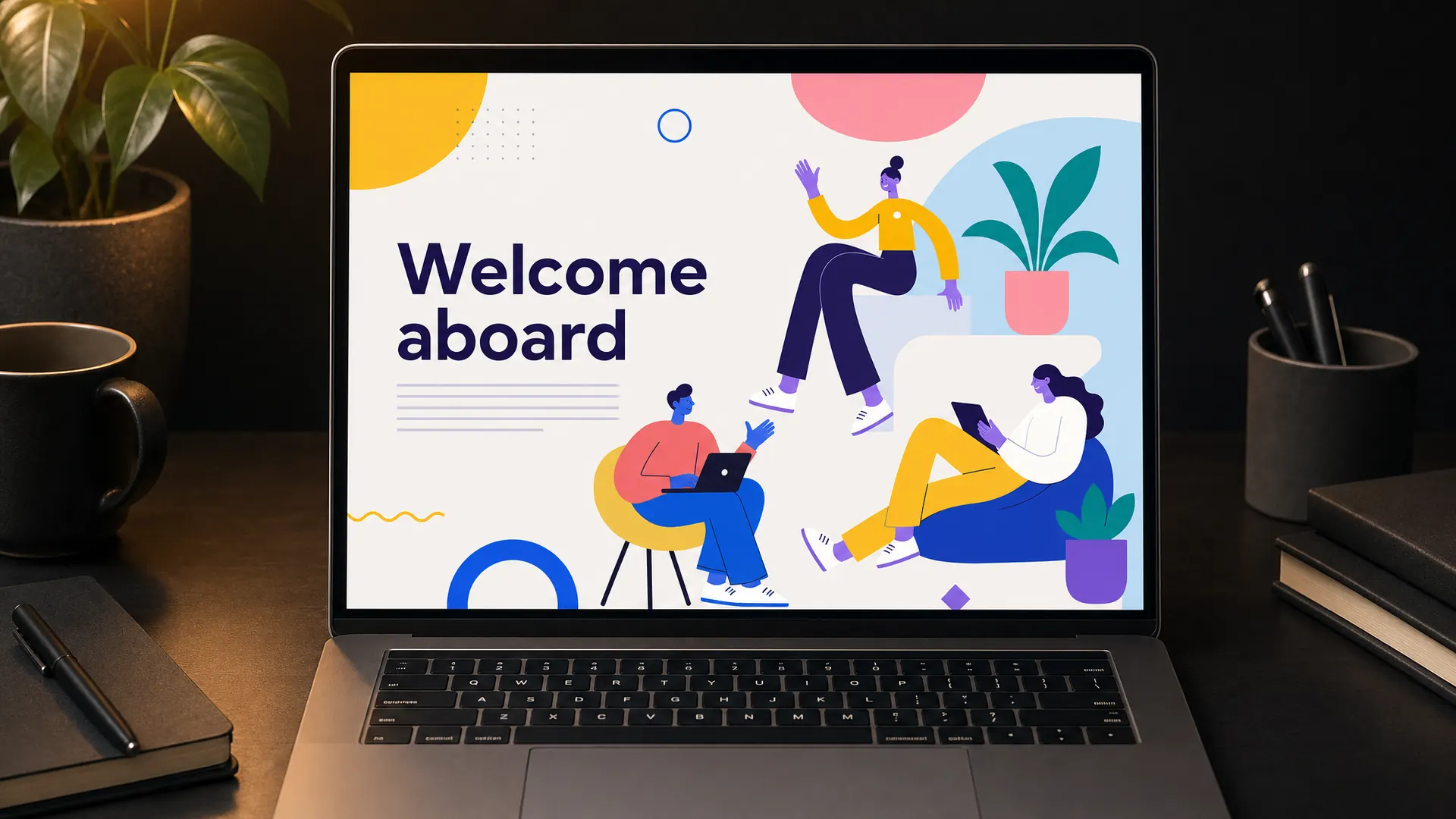
Corporate Memphis is the flat illustration style of tech companies: people with long limbs, small heads and skin in colours like purple and blue. Critics call it bland, so give it a twist if you use it.
In a course
Staff onboarding, where you need lots of friendly people quickly.
Try it this week
If you use it, give your characters real jobs and real props from your workplace.
The prompt for this picture
Photo for a training article. On a dark desk lit by one warm lamp, a laptop shows the opening screen of a staff onboarding course designed in CORPORATE MEMPHIS style: flat vector illustrations of people with long bendy limbs, small heads and non-realistic purple and blue skin, bright flat colours, oversized potted plants and floating abstract shapes. The heading reads “Welcome aboard”. Spell the quoted words exactly. Show all other small text as unreadable placeholder lines. Realistic devices, no logos.
Week 29 of 52
No. 24 Skeuomorphism
Origin In screen design it took shape at Apple in the 1980s. Apple dropped it for flat design in iOS 7 in 2013.
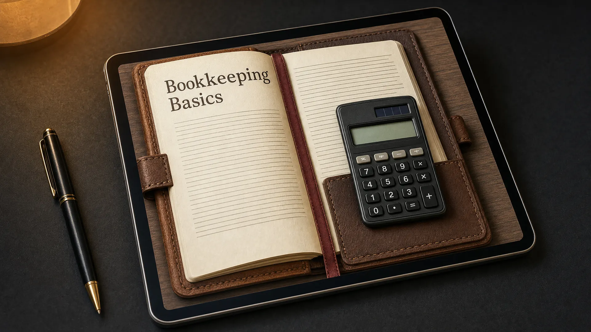
Skeuomorphism makes screens look like real objects: a leather ledger, a paper notepad, a wooden desk.
In a course
A bookkeeping or record-keeping course, where the screen looks like the book learners will use.
Try it this week
Make one activity look like the real form or tool your learners fill in.
The prompt for this picture
Photo for a training article. On a dark desk lit by one warm lamp, a tablet lies at an angle beside a real pen, showing a bookkeeping course designed in SKEUOMORPHISM: the screen looks like a real leather-bound ledger with stitched leather edges, cream ruled paper, a ribbon bookmark and a realistic pocket calculator with glossy buttons on a wooden desk texture. The ledger title reads “Bookkeeping Basics”. Spell the quoted words exactly. Show all other small text as unreadable placeholder lines. Realistic devices, no logos.
Week 30 of 52
No. 23 Glassmorphism
Origin Designer Michal Malewicz coined the name in 2020. Apple announced its Liquid Glass design in June 2025.
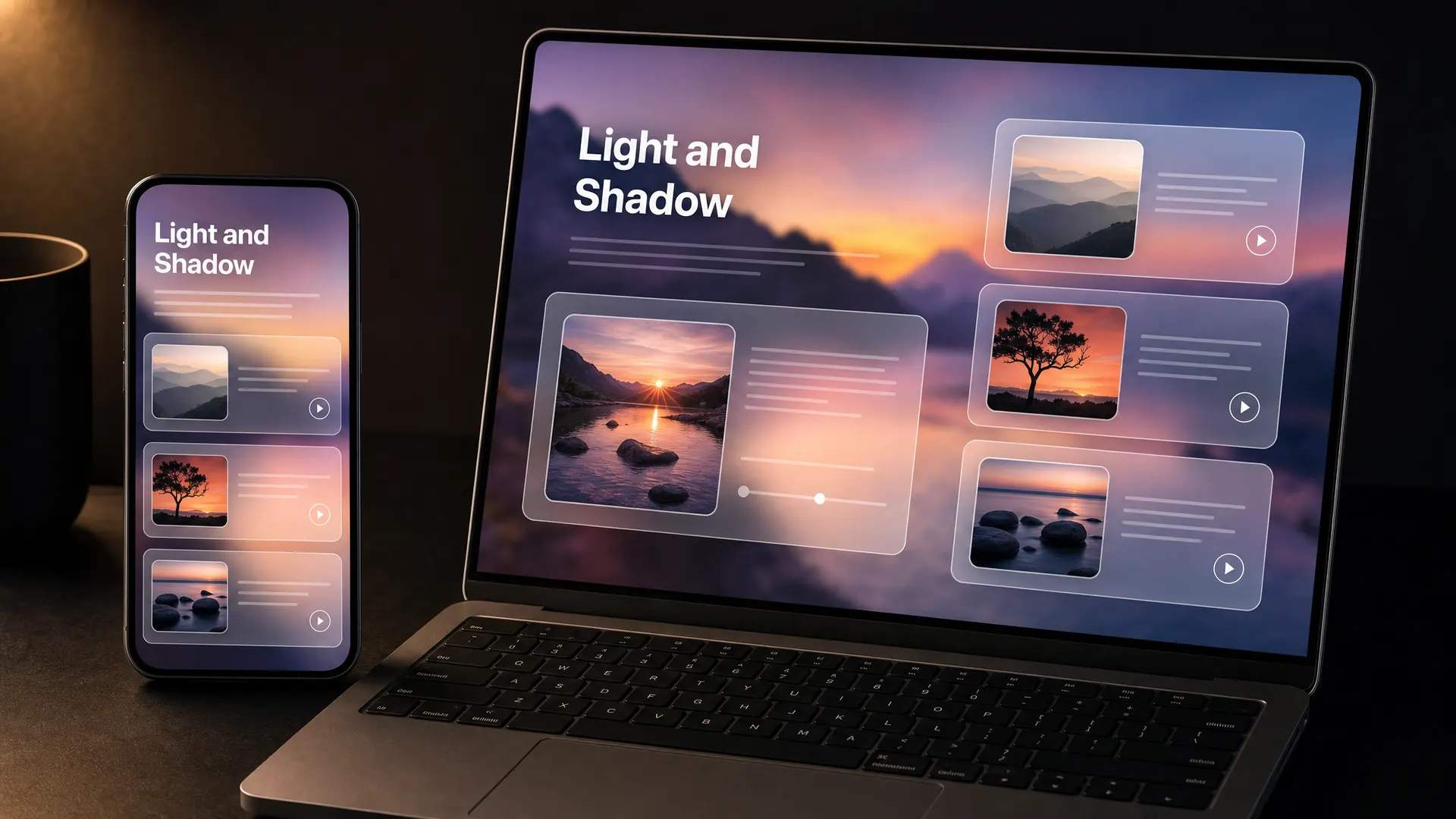
Glassmorphism stacks frosted, see-through panels over a colourful background, so the lesson seems to float.
In a course
A photography or design course with rich images behind the text.
Try it this week
Put one lesson menu on a frosted panel and check the text still reads.
The prompt for this picture
Photo for a training article. On a dark desk lit by one warm lamp, a smartphone and a laptop show a photography basics course designed in GLASSMORPHISM: frosted, translucent glass panels with soft white borders layered over a colourful blurred photograph of a sunset landscape, lesson cards floating at different depths. The heading reads “Light and Shadow”. Spell the quoted words exactly. Show all other small text as unreadable placeholder lines. Realistic devices, no logos.
Week 31 of 52
No. 22 Pixel art
Origin Researchers at Xerox PARC first published the term in 1982. The look comes from arcade games like Space Invaders and Pac-Man.

Pixel art draws everything with visible square pixels, like 8-bit and 16-bit video games.
In a course
A gamified quiz, such as a food safety quest with lives and levels.
Try it this week
Turn your end-of-module quiz into a pixel art level.
The prompt for this picture
Photo for a training article. On a dark desk lit by one warm lamp, a laptop shows a gamified food safety quiz designed in PIXEL ART: a 16-bit style commercial kitchen built from visible square pixels, a small chef character sprite, a row of pixel hearts for lives, a fridge with a thermometer, a chunky pixel font. The title reads “Food Safety Quest” and a blinking prompt reads “Press Start”. Spell the quoted words exactly. Show all other small text as unreadable placeholder lines. Realistic devices, no logos.
Week 32 of 52
No. 21 Neo-brutalism
Origin Grew out of brutalist web design. The Nielsen Norman Group points to Gumroad and Figma’s brand refresh as examples.

Neo-brutalism uses thick black outlines, flat bright colours, hard offset shadows and chunky type. It feels direct and confident.
In a course
A small business marketing course for people who want straight answers.
Try it this week
Give your buttons a black outline and a hard shadow.
The prompt for this picture
Photo for a training article. On a dark desk lit by one warm lamp, a laptop and a smartphone show a small business marketing course designed in NEO-BRUTALISM: thick black outlines on every element, flat bright colours (lemon yellow, hot pink, lime), hard offset black drop shadows, chunky rectangular buttons, a heavy grotesque sans-serif headline. The headline reads “Get customers” and a button reads “Start”. Spell the quoted words exactly. Show all other small text as unreadable placeholder lines. Realistic devices, no logos.
Week 33 of 52
No. 20 Collage
Origin From the French coller, to glue. Georges Braque and Pablo Picasso brought it into modern art in the early 20th century.
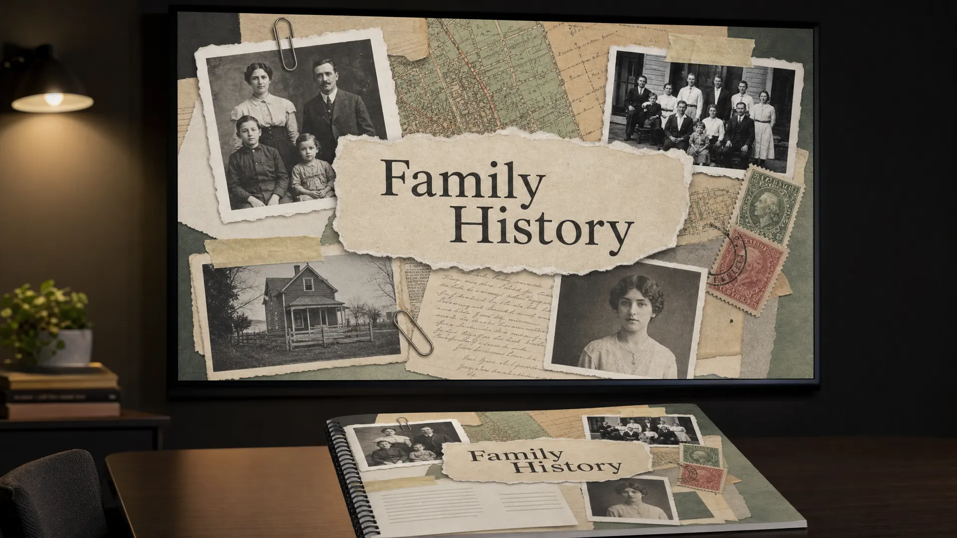
Collage builds a picture from cut and torn pieces: old photos, maps, stamps, notes and tape.
In a course
A course on family history, local history or memoir writing.
Try it this week
Make your course cover from scans of real objects.
The prompt for this picture
Photo for a training article. In a dim training room lit by one warm light, a large wall screen shows a family history course slide and a printed workbook lies on the table. Designed in COLLAGE style: layered cut and torn pieces of old black-and-white family photos, a vintage map, postage stamps, a handwritten letter, masking tape and paper clips. A torn paper label reads “Family History”. Spell the quoted words exactly. Show all other small text as unreadable placeholder lines. Realistic devices, no logos.
Week 34 of 52
No. 19 Blueprint
Origin John Herschel introduced the blueprint process in 1842. It copied engineering drawings for over a century.
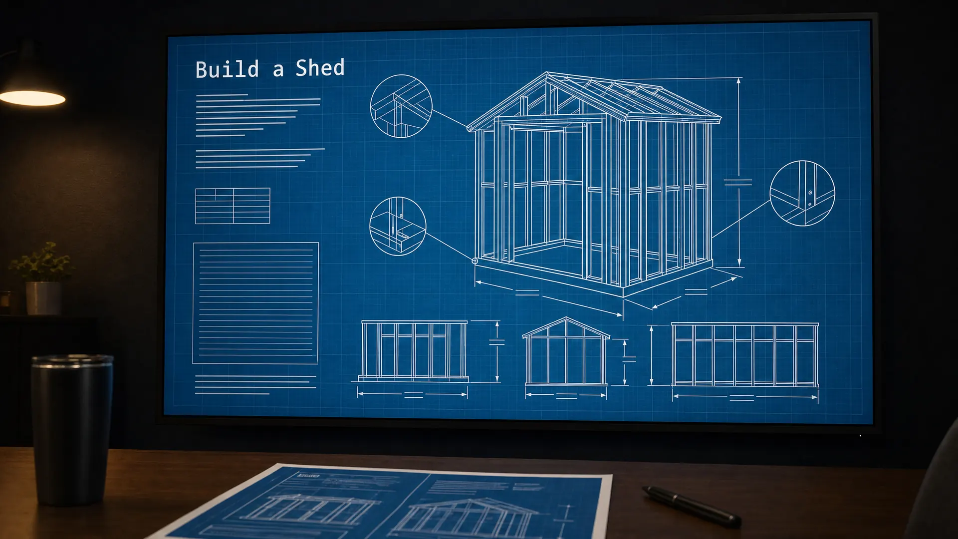
Blueprint style draws white technical lines on a deep blue background, with grids, measurements and labels.
In a course
Trades and technical how-to courses, like building a shed or wiring a trailer.
Try it this week
Draw one process as a blueprint with labelled parts.
The prompt for this picture
Photo for a training article. In a dim training room lit by one warm light, a large wall screen shows a slide from a shed building course and a printed handout lies on the table in front. Designed in BLUEPRINT style: crisp white technical line drawings of a garden shed frame on a deep cyan-blue background, a fine grid, dimension lines with arrows, callout circles and monospaced labels. The title reads “Build a Shed”. Spell the quoted words exactly. Show all other small text as unreadable placeholder lines. Realistic devices, no logos.
Week 35 of 52
No. 18 Hand lettering
Origin Lettering is the craft of drawing letters, separate from calligraphy and typesetting. Painted signs were its everyday home.
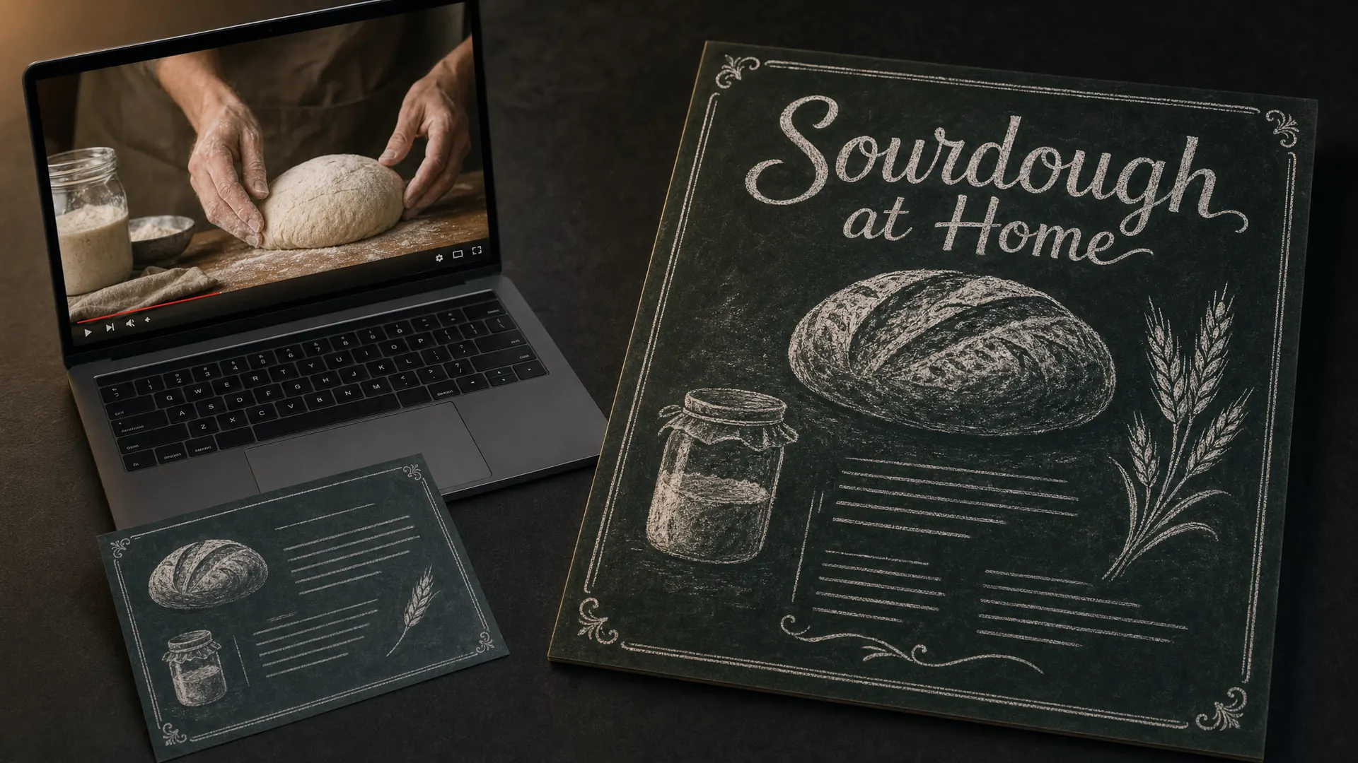
Hand lettering draws each word instead of typing it, so the letters can lean, curl and fill the space. Chalk on dark slate, like a café menu board, is its friendliest form.
In a course
Cooking, baking and hospitality courses, such as sourdough at home.
Try it this week
Hand-letter the title of one recipe or checklist card.
The prompt for this picture
Photo for a training article. On a dark desk lit by one warm lamp, a laptop shows a frame from a sourdough baking video lesson, with a printed recipe card beside it. Designed in HAND LETTERING: hand-drawn chalk lettering and sketches of a loaf, a jar of starter and wheat ears on a dark green-black slate, chalk dust smudges and decorative chalk borders. The title reads “Sourdough at Home”. Spell the quoted words exactly. Show all other small text as unreadable placeholder lines. Realistic devices, no logos.
Week 36 of 52
No. 17 Watercolour illustration
Origin Albrecht Dürer’s watercolours are among the earliest in Europe. Painters like J. M. W. Turner made it a medium in its own right in England.
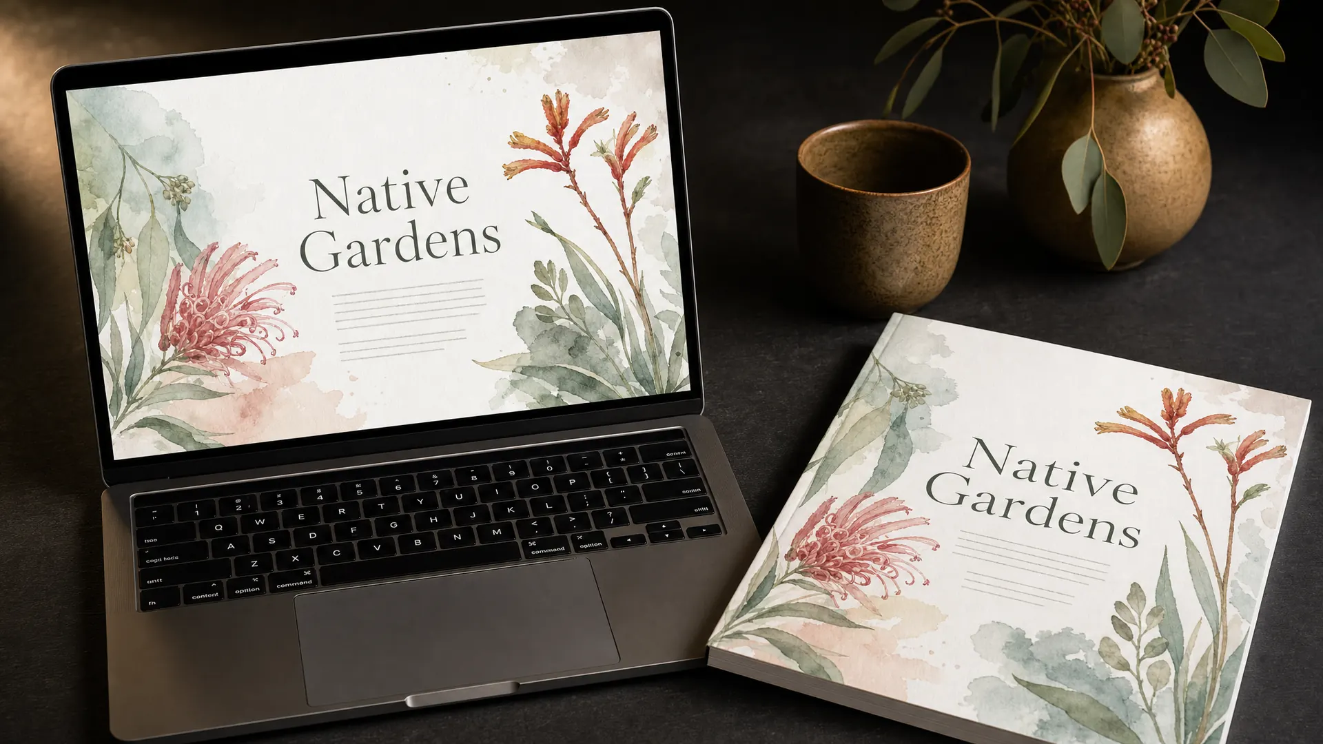
Watercolour uses soft, layered washes of colour with loose edges and visible paper. It feels calm and handmade.
In a course
A native garden course, a wellbeing program or anything gentle.
Try it this week
Commission or paint one watercolour illustration for your course cover.
The prompt for this picture
Photo for a training article. On a dark desk lit by one warm lamp, a laptop shows the home screen of a native garden design course and a printed workbook cover lies beside it. Designed in WATERCOLOUR ILLUSTRATION style: loose, layered watercolour washes of Australian native plants (grevillea, kangaroo paw, eucalyptus leaves), soft bleeding edges, visible paper texture, lots of white space, a delicate serif heading. The heading reads “Native Gardens”. Spell the quoted words exactly. Show all other small text as unreadable placeholder lines. Realistic devices, no logos.
Week 37 of 52
No. 16 Clay animation
Origin Segundo de Chomón’s Sculpteur moderne (1908) is an early example. Aardman’s Wallace and Gromit made it famous.
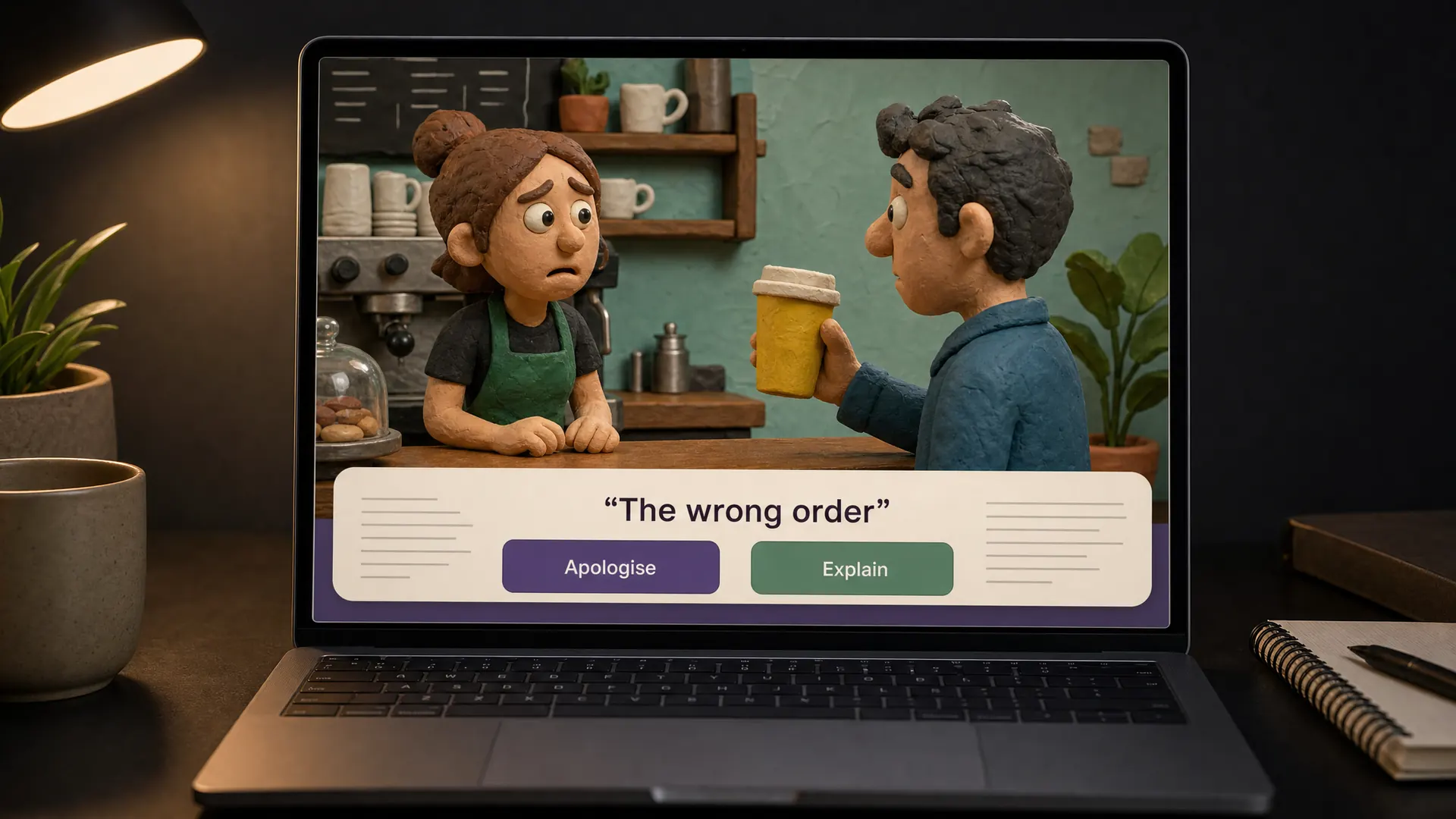
Clay animation moves handmade clay figures a frame at a time. Fingerprints and textures are part of the charm.
In a course
Customer service scenarios, where clay characters make a tense moment feel safe to practise.
Try it this week
Cast your scenario’s two characters as clay figures.
The prompt for this picture
Photo for a training article. On a dark desk lit by one warm lamp, a laptop shows a still from a customer service scenario designed in CLAY ANIMATION style: two handmade plasticine characters at a small café counter, a worried barista and a customer holding the wrong drink, visible fingerprints and modelling marks, tiny handmade props, stop-motion lighting. A caption bar reads “The wrong order” with two buttons “Apologise” and “Explain”. Spell the quoted words exactly. Show all other small text as unreadable placeholder lines. Realistic devices, no logos.
Week 38 of 52
No. 15 Chiaroscuro
Origin Italian for light-dark. The term dates from the Renaissance and is linked with Caravaggio and Rembrandt. On film, it’s the basis of film noir lighting.
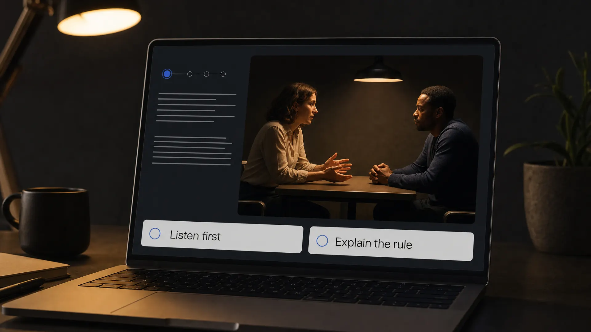
Chiaroscuro is strong contrast between light and dark. In photos it means one warm light, deep shadows and a cinematic mood. It’s the look of the pictures on this website.
In a course
A branching scenario about a difficult conversation, where the lighting carries the tension.
Try it this week
Light one scenario photo with a single lamp.
The prompt for this picture
Photo for a training article. On a dark desk lit by one warm lamp, a laptop shows a decision point in a branching scenario about a difficult conversation, designed with CHIAROSCURO photography: a cinematic low-key photo of two colleagues sitting across a small table under a single warm lamp, deep shadows, strong contrast between light and dark. Two choice buttons read “Listen first” and “Explain the rule”. Spell the quoted words exactly. Show all other small text as unreadable placeholder lines. Realistic devices, no logos.
Week 39 of 52
No. 14 Picture book illustration
Origin John Amos Comenius’s Orbis Pictus (1658) was the earliest illustrated book made for children.
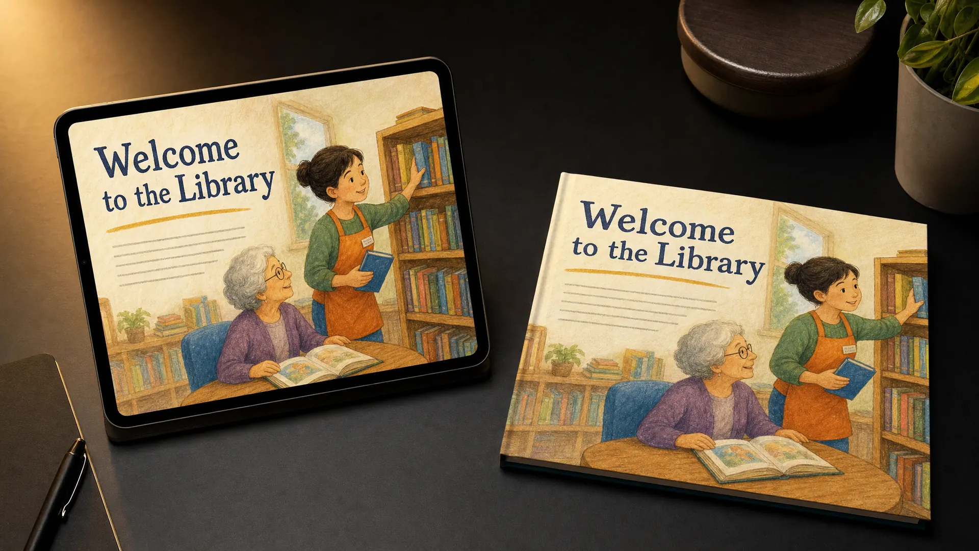
Picture book illustration uses warm, hand-painted or coloured-pencil scenes with a few lines of story set on the page.
In a course
Library or community volunteer training, told as a short story.
Try it this week
Write one lesson as a six-page picture book.
The prompt for this picture
Photo for a training article. On a dark desk lit by one warm lamp, a tablet stands next to a printed square picture book, both showing a library volunteer course designed as CHILDREN’S PICTURE BOOK ILLUSTRATION: warm gouache and coloured-pencil scenes of a volunteer shelving books and helping an older reader in a cosy community library, soft textures, a short line of story text set on the page. The page title reads “Welcome to the Library”. Spell the quoted words exactly. Show all other small text as unreadable placeholder lines. Realistic devices, no logos.
Between the weeks
Your course is your product
If you’re turning what you know into a course you sell, you probably don’t have a style guide yet. That’s a chance most course creators miss. The style you pick becomes your brand: the look people recognise in a course catalogue, an email or a social post.
Pick one style from this countdown. Write down your two colours, your two fonts and how you’ll use pictures. That’s the start of your own style guide. Use it on your course, your sales page and your free guide, and your knowledge starts to look like a product people will pay for. Our page on selling your course online covers pricing and platforms.
Quarter 4, weeks 40 to 52
The workhorses
Week 40 of 52
No. 13 Kinetic typography
Origin Saul Bass’s opening titles for North by Northwest (1959) were the first in a feature film to use it extensively.
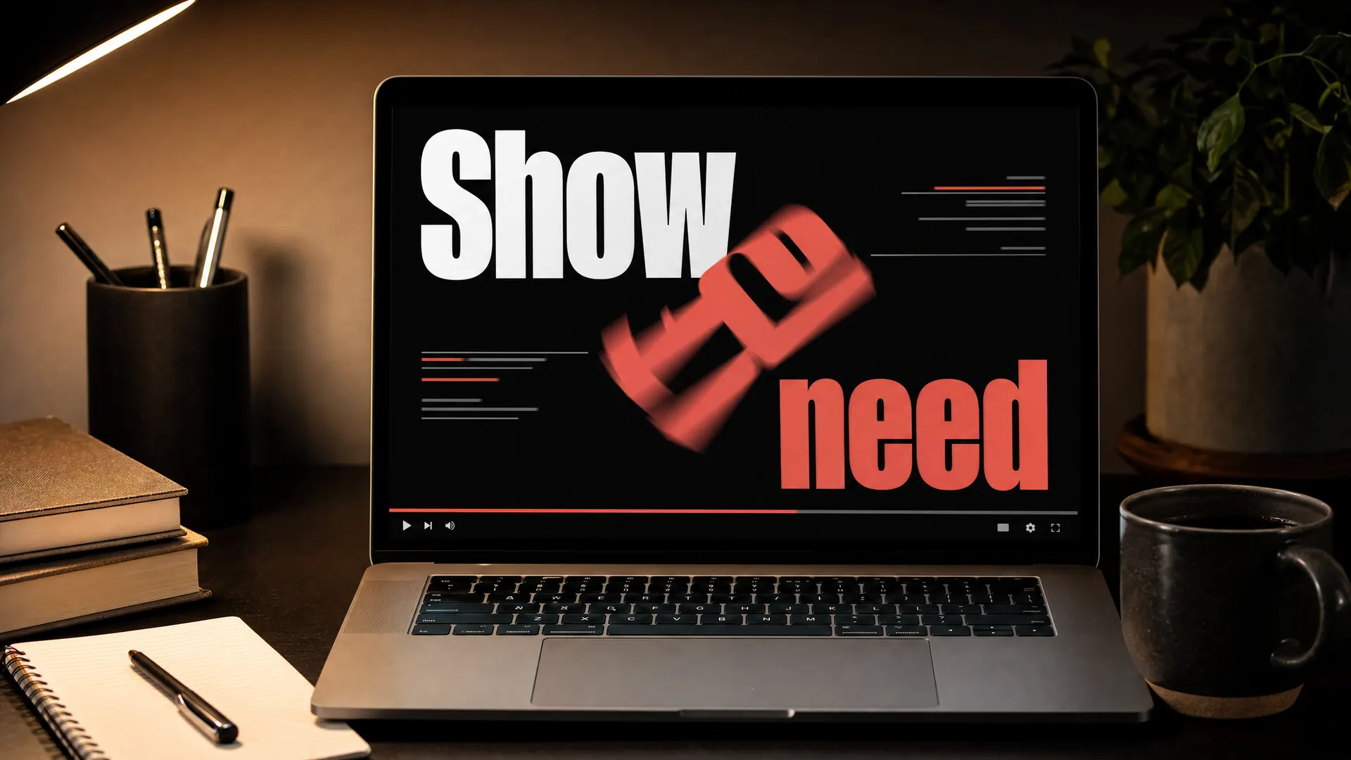
Kinetic typography makes the words the moving picture. They slide, grow, bounce and stack in time with the narration.
In a course
A short video on grant writing, or any topic where three key phrases matter most.
Try it this week
Animate your three key messages and nothing else.
The prompt for this picture
Photo for a training article. On a dark desk lit by one warm lamp, a laptop shows a frame from a grant writing video designed with KINETIC TYPOGRAPHY: huge bold words in motion, sliding, scaling and stacking, with motion blur trails, white and coral type on a black background, one word mid-rotation. The words read “Show the need”. Spell the quoted words exactly. Show all other small text as unreadable placeholder lines. Realistic devices, no logos.
Week 41 of 52
No. 12 Isotype
Origin Otto Neurath developed it in Vienna between 1925 and 1934, with Gerd Arntz drawing the pictograms. Teaching was always its main purpose.
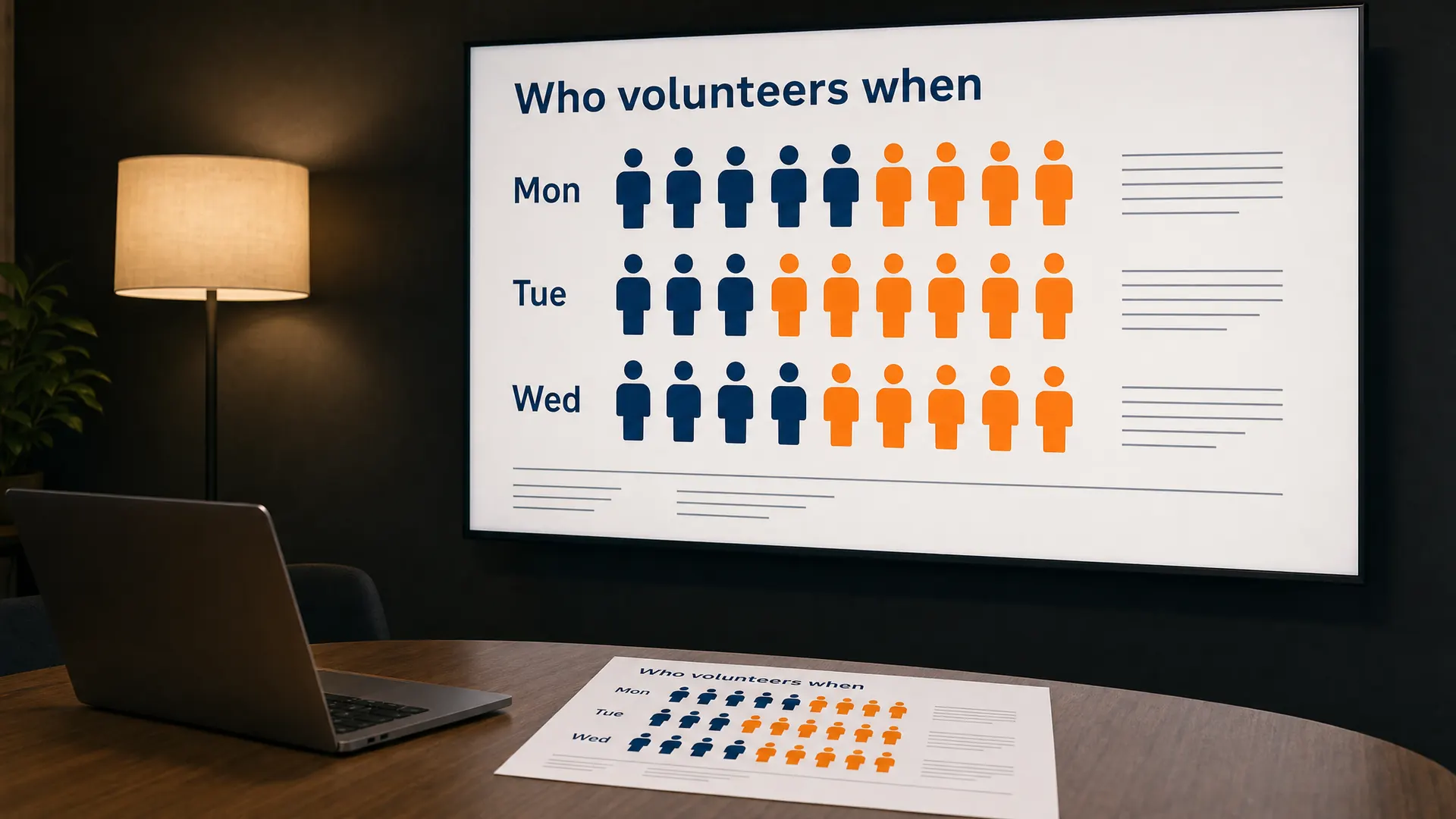
Isotype shows numbers as rows of repeated simple pictograms, with each symbol standing for a fixed amount.
In a course
An infographic slide about rosters, members or volunteers.
Try it this week
Replace one bar chart with rows of pictogram people.
The prompt for this picture
Photo for a training article. In a dim training room lit by one warm light, a large wall screen shows a volunteer roster infographic slide and a printed handout of the same chart lies on the table. Designed in ISOTYPE style: rows of identical simple flat pictogram people in two colours (navy and orange), each symbol the same size, rows labelled with days, clean sans-serif labels, no numbers. The heading reads “Who volunteers when” and the row labels read “Mon”, “Tue”, “Wed”. Spell the quoted words exactly. Show all other small text as unreadable placeholder lines. Realistic devices, no logos.
Week 42 of 52
No. 11 Editorial design
Origin Alexey Brodovitch, art director of Harper’s Bazaar from 1934 to 1958, set the modern magazine template.
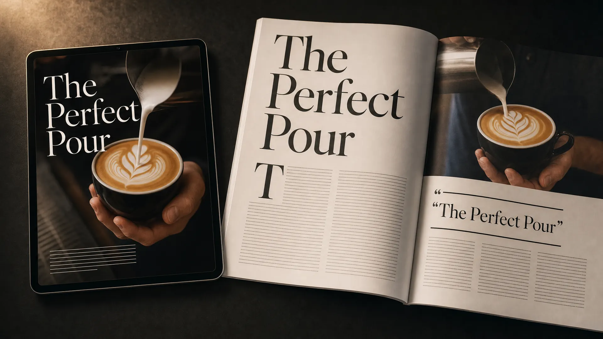
Editorial design borrows from magazines: big serif headlines, columns, pull quotes, drop caps and full-bleed photos.
In a course
A barista course, a travel course or any course that should read like a beautiful magazine.
Try it this week
Give one lesson a magazine-style opening page with a big photo and a pull quote.
The prompt for this picture
Photo for a training article. On a dark desk lit by one warm lamp, a tablet shows the opening page of a barista course lesson and a printed magazine-style workbook lies open beside it. Designed in EDITORIAL MAGAZINE style: a huge elegant serif headline, a full-bleed photo of latte art being poured, a large drop cap, a pull quote, neat columns of placeholder text. The headline reads “The Perfect Pour”. Spell the quoted words exactly. Show all other small text as unreadable placeholder lines. Realistic devices, no logos.
Week 43 of 52
No. 10 Bento grid
Origin Named after the Japanese bento lunch box. Apple uses it in its product videos.
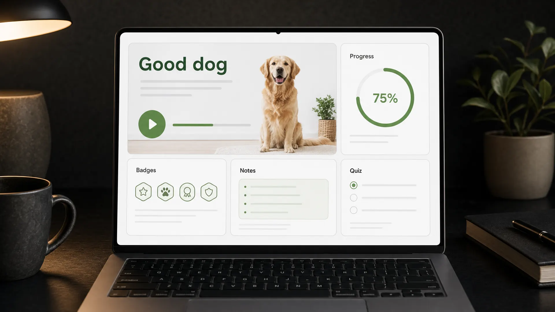
A bento grid arranges content in rounded tiles of different sizes, like a Japanese lunch box.
In a course
A course home page that shows progress, the next lesson, badges and notes at a glance.
Try it this week
Lay out your course dashboard as a bento grid.
The prompt for this picture
Photo for a training article. On a dark desk lit by one warm lamp, a laptop shows the home dashboard of a dog training course designed as a BENTO GRID: rounded rectangular tiles of different sizes arranged in a tidy grid (a large next-lesson video tile with a photo of a sitting dog, a progress ring, a badges tile, a notes tile, a quiz tile), clean light theme with one green accent. The large tile reads “Good dog”. Spell the quoted words exactly. Show all other small text as unreadable placeholder lines. Realistic devices, no logos.
Week 44 of 52
No. 9 Material Design
Origin Google announced it in June 2014. The latest version, Material 3 Expressive, arrived in May 2025.
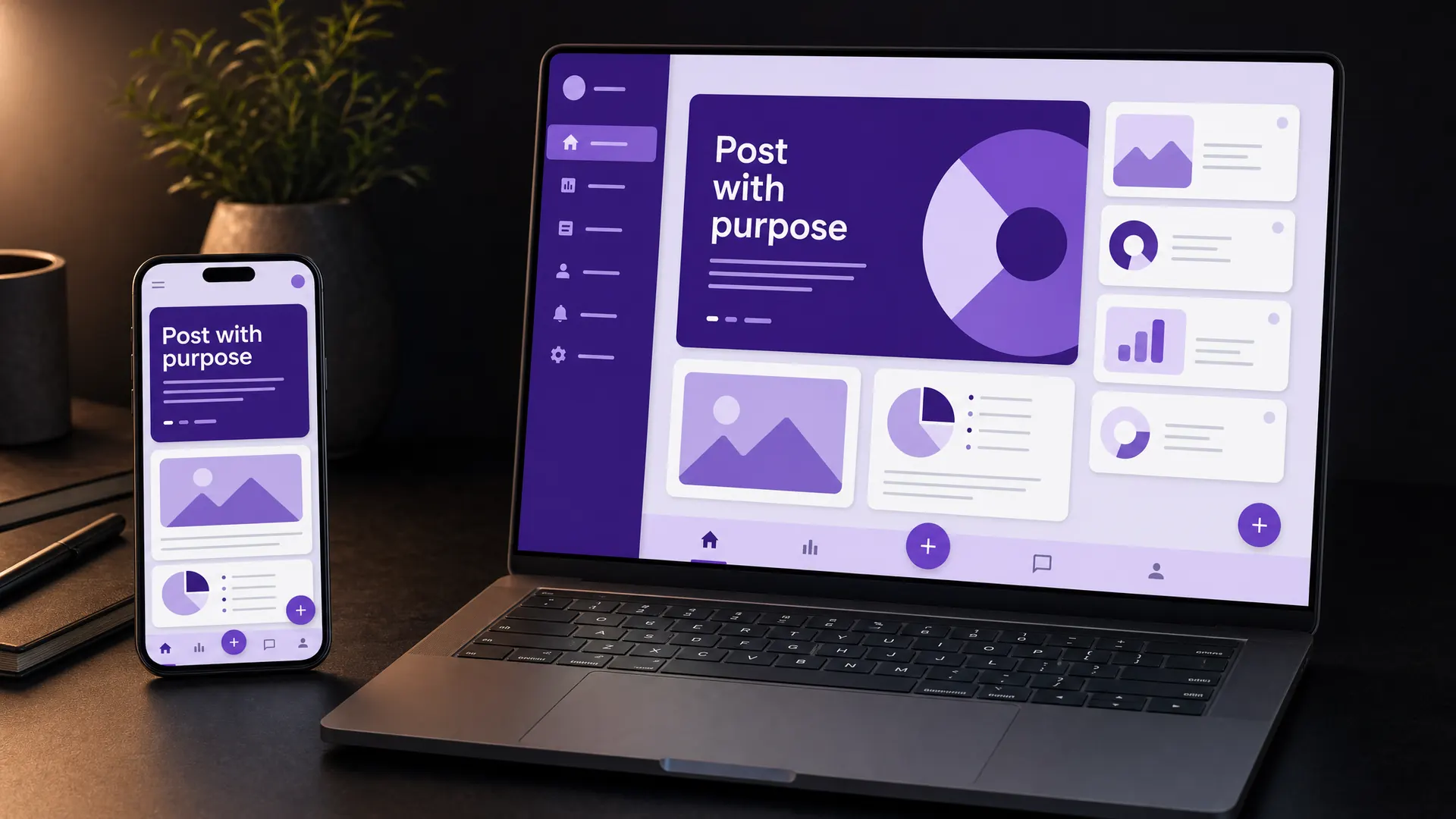
Material Design is Google’s design system: rounded cards, clear layers, bold colour surfaces and consistent buttons.
In a course
Phone-friendly courses for small business owners, who’ll find the controls familiar.
Try it this week
Use Material’s free colour tools to build a palette from your logo.
The prompt for this picture
Photo for a training article. On a dark desk lit by one warm lamp, a smartphone and a laptop show a social media course for small business owners designed in MATERIAL DESIGN: rounded cards, a floating action button, bold tonal colour surfaces in purple and lilac, clear elevation, a bottom navigation bar with simple icons, a clean geometric sans-serif. The heading reads “Post with purpose”. Spell the quoted words exactly. Show all other small text as unreadable placeholder lines. Realistic devices, no logos.
Week 45 of 52
No. 8 Swiss style
Origin Formed in Switzerland in the 1950s and 60s. Josef Müller-Brockmann perfected the grid at its heart.
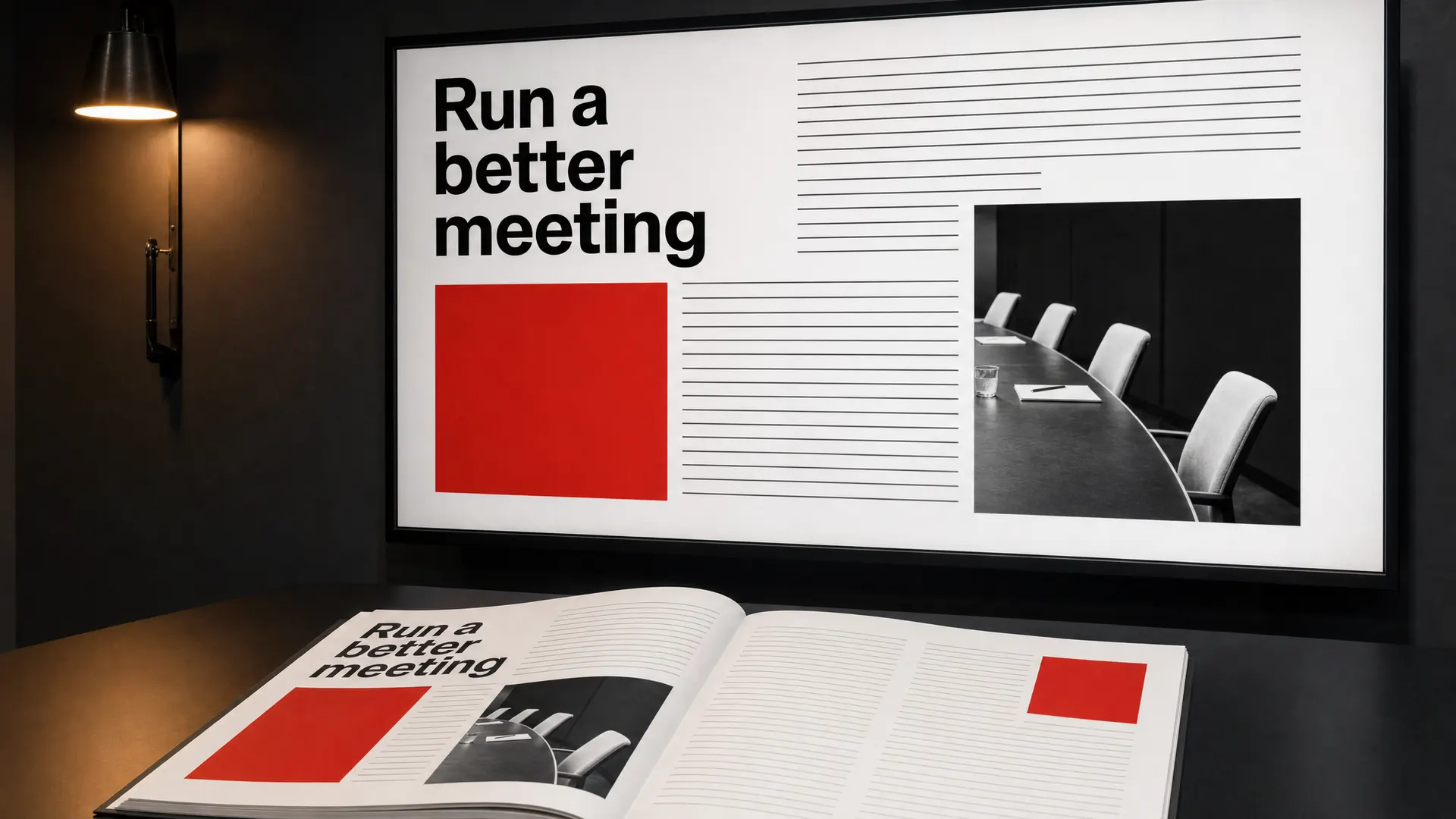
Swiss style, also called the International Typographic Style, uses a strict grid, large sans-serif type, text lined up on the left and lots of white space.
In a course
Slides and workbooks for governance, policy or any topic that needs to feel clear and trustworthy.
Try it this week
Set up a simple grid and line up everything on one slide.
The prompt for this picture
Photo for a training article. In a dim training room lit by one warm light, a large wall screen shows a slide from a committee governance course and a printed workbook spread lies on the table. Designed in SWISS STYLE (International Typographic Style): a strict modular grid, a large bold grotesque sans-serif heading set flush left, ragged-right placeholder text, black, white and one bright red, one black-and-white photograph placed on the grid. The heading reads “Run a better meeting”. Spell the quoted words exactly. Show all other small text as unreadable placeholder lines. Realistic devices, no logos.
Week 46 of 52
No. 7 Whiteboard animation
Origin The first whiteboard videos appeared on YouTube in 2009. It’s widely used for online learning and for teaching staff company policies.
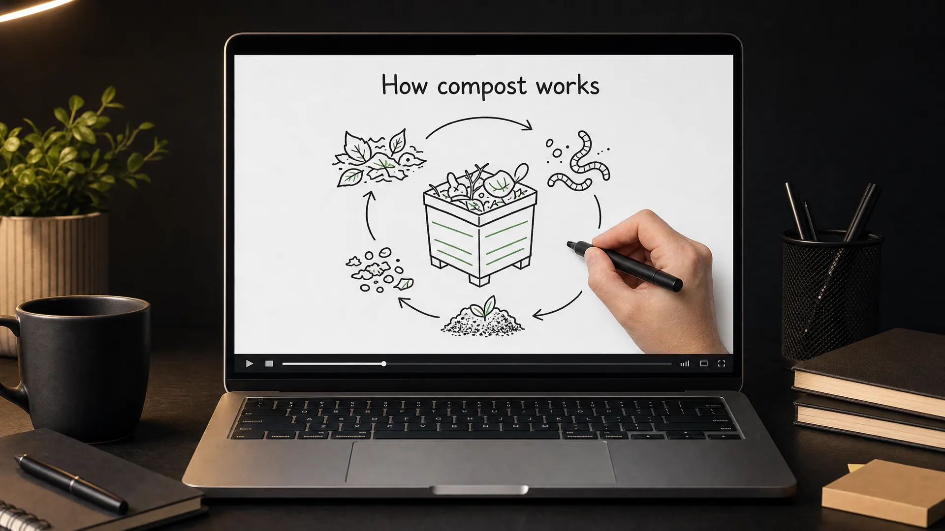
Whiteboard animation shows a hand drawing simple marker sketches on a white board while a voice explains.
In a course
Explaining a process step by step, such as how compost works.
Try it this week
Storyboard one process as six whiteboard sketches.
The prompt for this picture
Photo for a training article. On a dark desk lit by one warm lamp, a laptop shows a frame from a WHITEBOARD ANIMATION video about composting: a real hand holding a black marker is drawing simple sketches on a white board (a bin, worms, leaves, arrows in a cycle), clean black lines with a little green, mid-drawing. The heading on the board reads “How compost works”. Spell the quoted words exactly. Show all other small text as unreadable placeholder lines. Realistic devices, no logos.
Week 47 of 52
No. 6 Sketchnoting
Origin Designer Mike Rohde coined the word sketchnote in 2006. It’s popular with teachers.

Sketchnotes are visual notes: hand-drawn words, boxes, arrows and simple icons on one page.
In a course
Workbooks and summary pages that learners can copy or finish themselves.
Try it this week
Sketch your whole course on one page. It’s also the fastest way to plan it.
The prompt for this picture
Photo for a training article. On a dark desk lit by one warm lamp, a printed workbook page lies beside a laptop showing the same SKETCHNOTE as a slide: hand-drawn visual notes with boxed headings, arrows, banners, simple icons of a lightbulb, a person and a checklist, doodled bullet points, black ink with teal highlights. The central banner reads “Plan your course”. Spell the quoted words exactly. Show all other small text as unreadable placeholder lines. Realistic devices, no logos.
Week 48 of 52
No. 5 Isometric illustration
Origin William Farish formalised isometric drawing in a paper published in 1822. It’s now common in video games.
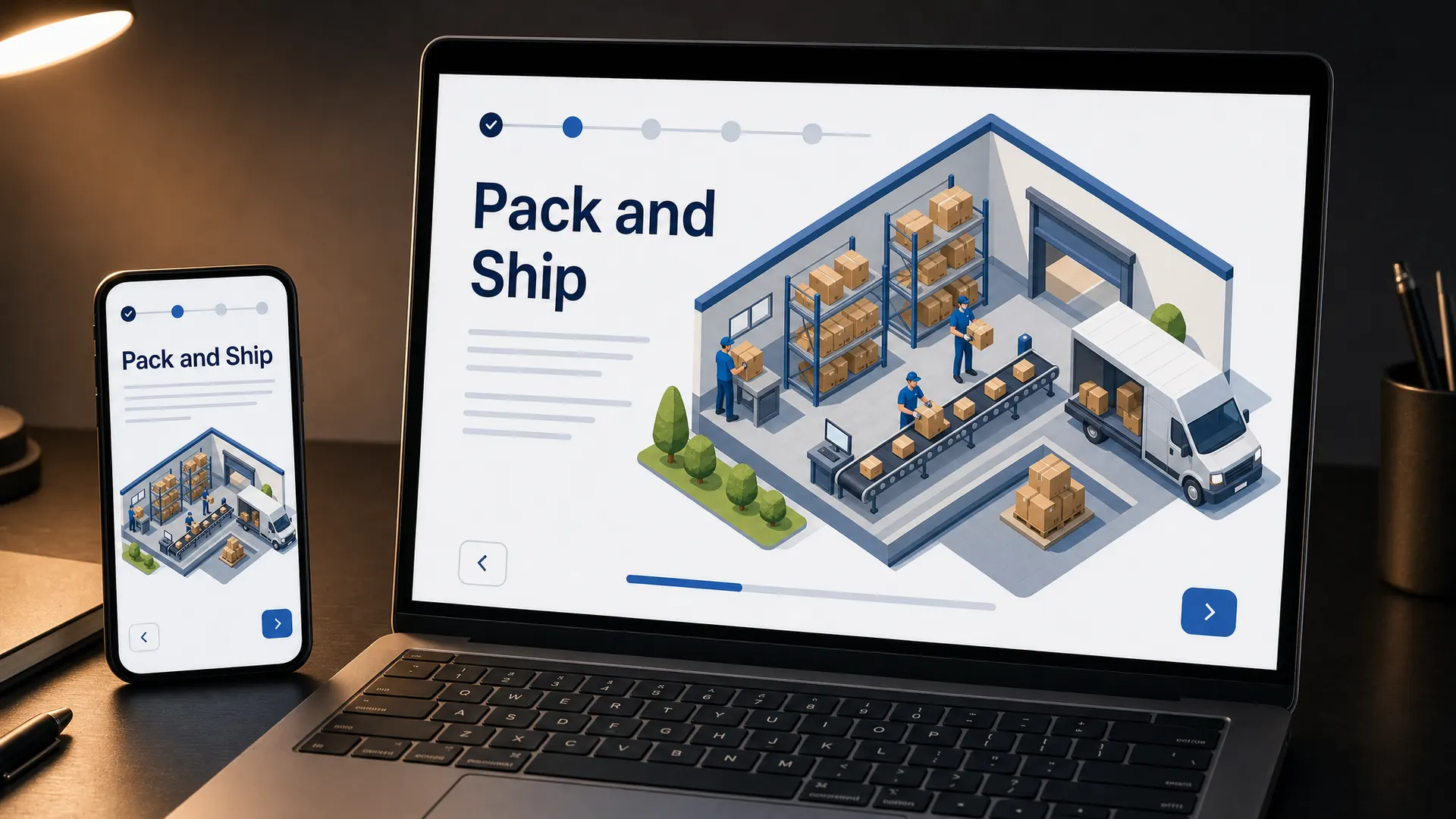
Isometric illustration draws 3D scenes at a fixed angle with no vanishing point, so everything looks like a tidy model.
In a course
Showing a workplace, a process or a system, like how an order moves through a warehouse.
Try it this week
Draw your workplace as an isometric map for your induction.
The prompt for this picture
Photo for a training article. On a dark desk lit by one warm lamp, a laptop and a smartphone show an online order process course designed in ISOMETRIC ILLUSTRATION: a small warehouse drawn at a fixed 30 degree angle with no vanishing point, shelves, boxes moving along a conveyor, a delivery van, tiny workers, clean flat colours with subtle shading. The heading reads “Pack and Ship”. Spell the quoted words exactly. Show all other small text as unreadable placeholder lines. Realistic devices, no logos.
Week 49 of 52
No. 4 Comics
Origin Europe dates comics to Swiss artist Rodolphe Töpffer in 1827. Superman’s first appearance in 1938 began the golden age of comic books.
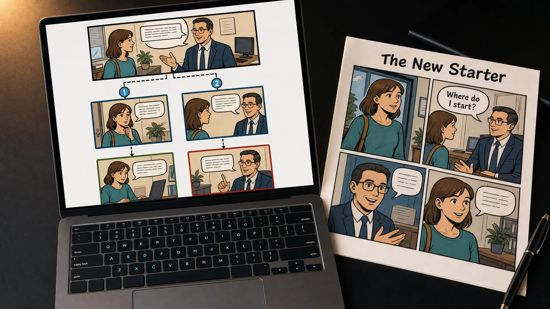
Comics tell a story in panels with speech bubbles, bold inks and flat colour.
In a course
Workplace scenarios, where learners follow a character through a tricky first week.
Try it this week
Turn one scenario into a four-panel comic.
The prompt for this picture
Photo for a training article. On a dark desk lit by one warm lamp, a laptop shows a branching scenario in COMIC BOOK style and a printed comic handout lies beside it: four panels with bold black inks and flat colour, an original new staff member on her first day meeting her supervisor, speech bubbles. The page title reads “The New Starter” and one speech bubble reads “Where do I start?”. Spell the quoted words exactly. Show all other small text as unreadable placeholder lines. Realistic devices, no logos.
Week 50 of 52
No. 3 Documentary photography
Origin Jacob Riis’s How the Other Half Lives (1890) is its best-known early work. In the 1930s the US Farm Security Administration funded photographers such as Dorothea Lange.
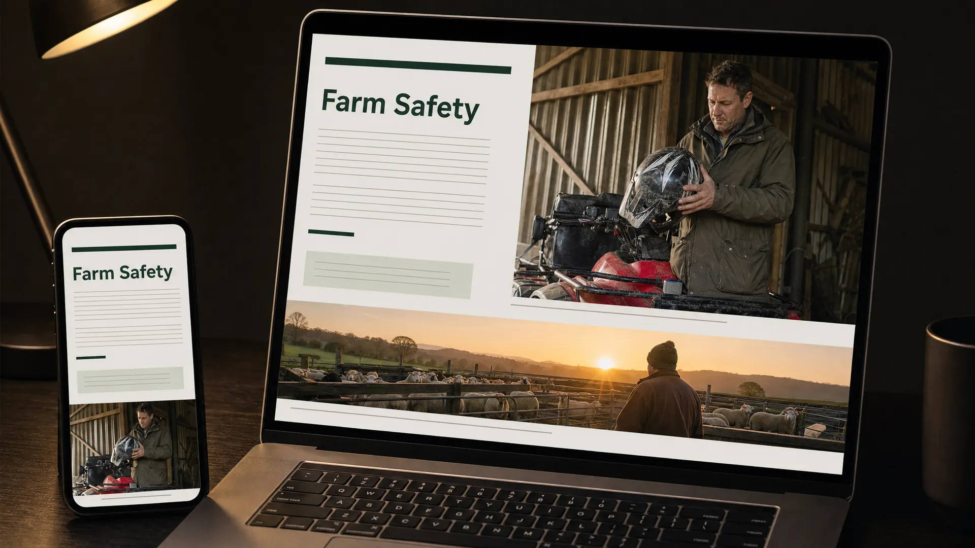
Documentary photography shows real people doing real work in natural light. Nobody poses.
In a course
Farm, trade or workplace safety, where learners need to recognise their own world.
Try it this week
Replace one stock photo with a real photo from your workplace.
The prompt for this picture
Photo for a training article. On a dark desk lit by one warm lamp, a laptop and a smartphone show a farm safety course illustrated with DOCUMENTARY PHOTOGRAPHY: candid natural-light photos of a real-looking farmer checking a quad bike helmet in a shed and sheep yards at dawn, muted honest colours, no posing, small photo captions as placeholder lines. The heading reads “Farm Safety”. Spell the quoted words exactly. Show all other small text as unreadable placeholder lines. Realistic devices, no logos.
Week 51 of 52
No. 2 Minimalism
Origin Grew from the 1960s art movement and architect Mies van der Rohe’s motto, less is more.
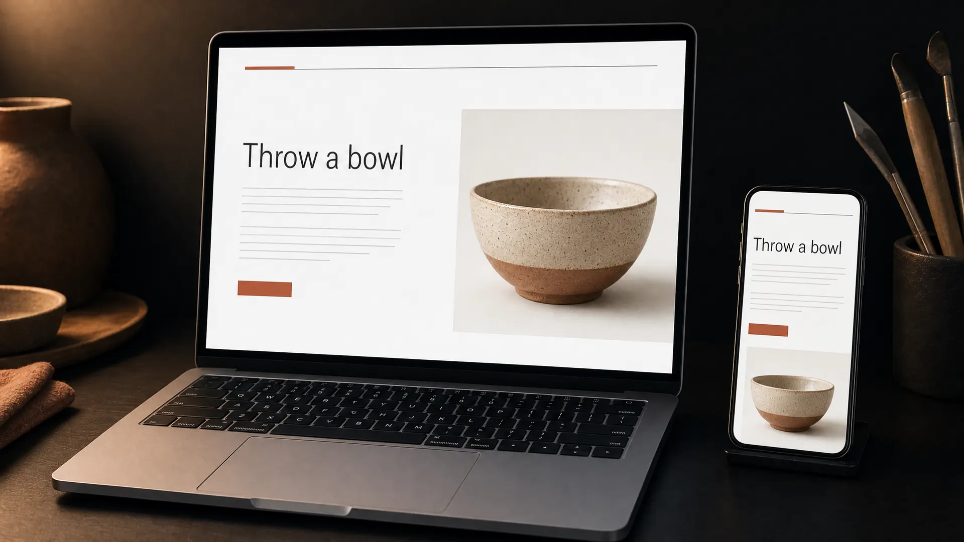
Minimalism strips everything back: plenty of white space, one typeface, one accent colour and nothing that doesn’t help.
In a course
Almost any topic, especially courses people take on a phone.
Try it this week
Remove one thing from every screen in your course.
The prompt for this picture
Photo for a training article. On a dark desk lit by one warm lamp, a laptop and a smartphone show a pottery basics course designed in MINIMALISM: mostly white space, one photo of a handmade ceramic bowl, one typeface, one terracotta accent colour, a thin simple navigation line. The heading reads “Throw a bowl”. Spell the quoted words exactly. Show all other small text as unreadable placeholder lines. Realistic devices, no logos.
Week 52 of 52
No. 1 Flat design
Origin Rooted in Swiss style, then made mainstream by Microsoft’s Metro design in 2010 and Apple’s iOS 7 in 2013.
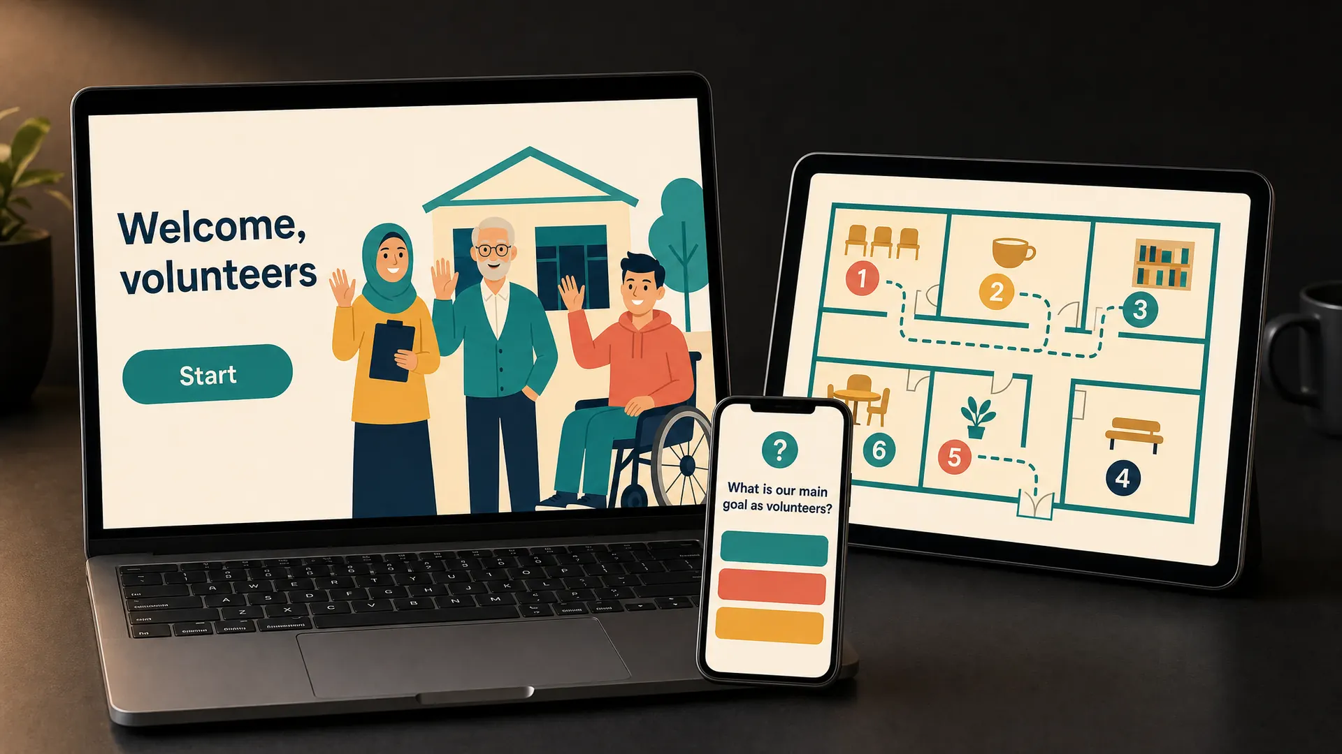
Flat design uses solid colours and simple shapes with no shadows, gradients or textures. It’s clear on any screen and quick to build, so you can afford to update it. Add a small cast of characters and it does almost everything a course needs.
In a course
Induction, customer and member training, and our first pick for a course you plan to sell.
Try it this week
Draw three characters your learners will recognise, and use them on every screen.
The prompt for this picture
Photo for a training article. On a dark desk lit by one warm lamp, a laptop, a tablet and a smartphone stand together in a tidy cluster. All three screens show the same volunteer induction course designed in FLAT DESIGN: two-dimensional illustration with solid colours, no gradients, textures or shadows, simple geometric shapes and clean sans-serif type. The laptop shows three friendly cartoon characters waving in front of a community hall, the heading “Welcome, volunteers” and a rounded “Start” button. The tablet shows a flat map of the hall with numbered stops. The phone shows one quiz question with three answer buttons. Palette: warm off-white, teal, coral, mustard and navy. Spell the quoted words exactly. Show all other small text as unreadable placeholder lines. Realistic devices, no logos.
How to pick your style
Three questions will narrow 52 styles down to two or three.
- Who are your learners, and where will they take the course? A shift worker on a phone needs a different look from a manager at a desk.
- How do you want them to feel? Calm, curious, confident or entertained. Each style on this list leans one way.
- Can you keep it up? Every new lesson has to match. A style you can repeat easily beats a dazzling one you can’t.
Whatever you pick, every learner has to be able to read and use your course. Keep text dark on light or light on dark with strong contrast, use fonts that are easy to read, and never let anything flash.
Make pictures for your own course
Pick a style, copy its prompt and change the topic and the words in quotes. Make one picture first and check every word on it before you make the rest. AI image tools can write small text that looks real and isn’t, so keep body text as placeholder lines and put the real words on your page, where learners can read them.
Try ElevenLabs (opens the ElevenLabs website in a new tab)
Discover Learning is an independent ElevenLabs affiliate. If you sign up through our link, we may receive a commission. It doesn’t change our advice or your price.
Questions
Questions about design styles
What’s the best design style for an online course?
For most courses, flat design or minimalism. Both are clear on a phone, quick to build and easy to keep consistent as you add lessons. Add a small cast of characters to make the course memorable.
Can I use a different style for each module?
Keep one main style for the whole course so learners always know where they are. You can borrow a second style for one special moment, such as a comic scenario or a pixel art quiz.
Do design styles affect accessibility?
Yes. Some styles, like neumorphism and glassmorphism, can make text and buttons hard to see. Whatever style you choose, check the contrast, keep body text plain and avoid anything that flashes.
Can Discover Learning build my course in one of these styles?
Yes. Tell us which style caught your eye when you send us your material. Our courses are fixed price, from $2,750 for a 15-minute course.
Sources for every style, checked 9 November 2026
We checked each style and its origin against these pages. Every picture in this article is an example we made for it, not a real client’s course.
- No. 52, Glitch art: Wikipedia: Glitch art
- No. 51, Psychedelic art: Wikipedia: Psychedelic art
- No. 50, Grunge typography: Wikipedia: Grunge typography, Wikipedia: David Carson (graphic designer)
- No. 49, Cyberpunk: Wikipedia: Cyberpunk
- No. 48, Synthwave: Wikipedia: Synthwave
- No. 47, Steampunk: Wikipedia: Steampunk
- No. 46, Maximalism: Wikipedia: Maximalism
- No. 45, Y2K aesthetic: Wikipedia: Y2K aesthetic
- No. 44, Frutiger Aero: Wikipedia: Frutiger Aero
- No. 43, Zine: Wikipedia: Zine
- No. 42, Constructivism: Wikipedia: Constructivism (art), Tate
- No. 41, Art Nouveau: Wikipedia: Art Nouveau, V&A
- No. 40, Pop art: Wikipedia: Pop art, Tate
- No. 39, Retrofuturism: Wikipedia: Retrofuturism
- No. 38, Low poly: Wikipedia: Low poly
- No. 37, Neumorphism: Wikipedia: Neumorphism, Interaction Design Foundation
- No. 36, De Stijl: Wikipedia: De Stijl, Tate
- No. 35, Memphis design: Wikipedia: Memphis Group
- No. 34, Kawaii: Wikipedia: Kawaii
- No. 33, Solarpunk: Wikipedia: Solarpunk
- No. 32, Letterpress: Wikipedia: Letterpress printing
- No. 31, Woodcut and linocut: Wikipedia: Woodcut, Wikipedia: Linocut, Tate
- No. 30, Risograph: Wikipedia: Risograph
- No. 29, Duotone: Wikipedia: Duotone
- No. 28, Art Deco: Wikipedia: Art Deco, V&A
- No. 27, Mid-century modern: Wikipedia: Mid-century modern
- No. 26, Bauhaus: Wikipedia: Bauhaus, Tate
- No. 25, Corporate Memphis: Wikipedia: Corporate Memphis
- No. 24, Skeuomorphism: Wikipedia: Skeuomorph, Interaction Design Foundation
- No. 23, Glassmorphism: Wikipedia: Glassmorphism, Wikipedia: Liquid Glass, Nielsen Norman Group, Apple Newsroom
- No. 22, Pixel art: Wikipedia: Pixel art
- No. 21, Neo-brutalism: Nielsen Norman Group, LogRocket
- No. 20, Collage: Wikipedia: Collage
- No. 19, Blueprint: Wikipedia: Blueprint
- No. 18, Hand lettering: Wikipedia: Lettering
- No. 17, Watercolour illustration: Wikipedia: Watercolor painting
- No. 16, Clay animation: Wikipedia: Clay animation, Wikipedia: Will Vinton
- No. 15, Chiaroscuro: Wikipedia: Chiaroscuro
- No. 14, Picture book illustration: Wikipedia: Picture book
- No. 13, Kinetic typography: Wikipedia: Kinetic typography
- No. 12, Isotype: Wikipedia: Isotype (picture language)
- No. 11, Editorial design: Wikipedia: Alexey Brodovitch, Wikipedia: Editorial design
- No. 10, Bento grid: freeCodeCamp
- No. 9, Material Design: Wikipedia: Material Design, Google Design
- No. 8, Swiss style: Wikipedia: Swiss Style (design), Wikipedia: International Typographic Style
- No. 7, Whiteboard animation: Wikipedia: Whiteboard animation
- No. 6, Sketchnoting: Wikipedia: Sketchnoting
- No. 5, Isometric illustration: Wikipedia: Isometric projection
- No. 4, Comics: Wikipedia: Comics, Wikipedia: Comics in education
- No. 3, Documentary photography: Wikipedia: Documentary photography
- No. 2, Minimalism: Wikipedia: Minimalism, Tate
- No. 1, Flat design: Wikipedia: Flat design, Nielsen Norman Group
Fixed price, fixed date
Pick a style. We’ll build the course.
Send us your material and the style that caught your eye. We reply with a fixed price, a launch date and what’s included, usually after a 20-minute call.
- Prices in Australian dollars, ex GST
- Half up front, half when you go live
- One round of edits included in every course
- Call us on 1300 208 943